Category Archives: Final Project Reports

Corona Chronicles Final Group Project Report

  1. Project Summary

Goals:

Corona Chronicles is a global digital collection for middle and high school students to share their lived experiences through the Covid-19 pandemic, as well as to allow them to witness and learn what students in other geographical locations (locally, nationally, and internationally) express about their experiences. In order to foster a space for building empathy and a sense of connection, participants tell their stories through various artistic mediums such as poetry, visual images, film, short responses and essays, 3D rendering, and short documentaries.

The Corona Chronicles collection provided an opportunity for young people to co-create and design the collection with the project team in order for them to develop the website in ways that feels representative and accessible to their age demographic. This in turn provides honest and unadulterated information to educators, guardians, and institutions regarding ways to better support young people during this time. From a pedagogical perspective, this project may serve the objectives of affective curriculum development, including support of socio-emotional well being, which will take on great importance as students return to in-person schooling after extended periods or remote learning.

From a Digital Humanities, “tech for good” perspective, the Corona Chronicles is not only youth centered, but it also trusts that our student contributors and collaborators are experts of their own experiences and that the value of their voices are what make this digital endeavor necessary and vital. Documenting and collecting their stories in real time is crucial to offering a more complete account of what will be written and understood about this unprecedented time.

 Outcomes:

 The general outcomes of the Corona Chronicles digital collection were primarily successful. With the initial expectation of receiving only six contributions, the project exceedingly surpassed its goal and collected more than 30 submissions. Students living in New York, Vermont, Virginia, Texas, and Lima, Peru offered their experiences through the various art forms stated above. The digital collection now displays 32 pieces with accompanying descriptions.

After collaborating with our Student Advisory Board, and regularly meeting with them for brainstorming sessions and focus group meetings, we successfully integrated most of their ideas on aesthetics, content, and representation. Our student advisors and other contributors were largely satisfied with the final product. 

Primary Collaborators:

Corona Chronicles Collection’s primary collaborators were 3 students chosen for the Student Advisory Board and all of the students who contributed to the collection. Also, the project members received an informal consultation from Lara Alonso and Victor Clemente, the creators of coronastories.world, and implemented many Digital Humanities approaches provided from a presentation by Dr. Lisa Rhody. Lastly, Debora Vasquez from The Point CDC, translated the project’s consent form to Spanish.

Link to Project: corona-chronicles.world

  1. Project Origins and Goals

Motivation for Development & Funding:

There are currently a range of digital archives collecting and sharing stories of individuals living through the Covid-19 pandemic, however, there is no collection dedicated to telling and connecting the stories of children across diverse geographic regions and backgrounds through a range of multimedia. We believe that the act of producing, sharing, and engaging with these stories is allowing students to develop a sense of connection through a period of widespread isolation, as well as to develop empathy and understanding of others living in different circumstances of their own. In order to continue developing this project, funding will be necessary to cover the following expenses: expand outreach across international networks, provide some form of compensation to contributors (not necessarily monetary), extend Adobe Portfolio licenses, and hiring consultants and team members to sustain the long-term maintenance of the collection.

Intended Audiences & Fields of Study:

Adolescents and teenagers (ages 11-18) are the intended primary users and audiences, but it is also equally important for parents, educators, other adults, and institutions to engage with the digital collection. Our hope is that these care-takers and educational providers will be able to empathize and better understand the ways in which young people need support during the pandemic and moving forward. This project also offers other graduate students and researchers, particularly those interested in child and developmental psychologies, with material to analyze and build upon. The fields of studies we engaged were education, art, archive, digital humanities, data visualization, and mapping.

Past Work We Built On:

There are many examples of archives collecting the experiences of college students and adults, such as Providence College Pandemic Archive, The Ball Statue University Pandemic Archive, and The Los Angeles Public Library Archive, but the presence of children’s voices and expression in storytelling collections during the pandemic is limited. Among child-focused projects, Child Art focuses on younger children and visual expression, and from a global or international perspective, Corona Stories are all video documentations of people (many adults and a handful of children) explaining their experiences. Still other collections are contest-based and exhibit only a small number of student submissions. While all of these projects are important foundational references, Corona Chronicles seeks to address several gaps: our collection is exclusively student voices, a range of multimedia and art is encouraged, young people ages 11-18 are co-creators of the collection, and the user interface were intentionally designed for ease and interest of engagement by the intended end-user (youth).

3. Project Activities, Team, & Participants

Concrete Activities:

Over the course of 14 weeks, the team completed concrete activities to get us to our end goal of creating an ethically and socially safe digital collection where students can share their voices. For our initial group organization activities, we first created a week by week work plan with our major milestones as checkpoints to guide the deliverables. We also drafted and signed a collaborator’s work agreement to keep us all committed and accountable as we worked together. 

Next we tackled the challenge of writing the submission and consent form that students and parents fill out together to participate in our digital collection. Our translation consultant provided us with a Spanish version of this form to help reach a wider audience of contributors. Our outreach coordinators put together the plan for working with the team’s existing professional education network via in-person and email campaigns. We also set up an Instagram account to recruit submissions from the public as well as foster a community for students who have already contributed to further share their artwork. To help students create their submissions in the best possible format for uploading, we created a submission checklist document. The final outreach component we created is a trailer advertising the project for viewers to learn more about the project’s mission. 

After deciding on the Content Management System for our site, we met with our Student Advisory Board and pitched them a few options for the home page and overall design elements. The team agreed on a designed masthead, color scheme, and layout. We established a careful folder organization system to intake student submissions, as well as a naming convention to follow. As submissions started coming in, our multimedia manager edited videos for length and added an icon that details the name and location of each student. Once video editing is complete, they’re uploaded to the student’s individual gallery page on the site by our web developer. The same process is followed for the other submission formats (photo, text, artwork) that didn’t require editing. All of this was documented in a process workflow diagram for team members to reference. 

Finally as a thank you to participating students, we created a letter of recognition and certificate with the site’s branding displayed. Each student’s individual name is added before our outreach coordinators send out to them over email. At the end of our scheduled 14 weeks, the team created a presentation that features student submissions and explains the purpose of Corona Chronicles. 

Recruiting Participants: The team was constructed from professor guidelines for a praxis seminar. Our team leader presented the idea for the project and interested participants signed up.

Social Challenges: Due to covid-19, many/most of our contributors are participating in distant learning. This made physical outreach and access to our in-state student networks difficult. Some of the challenges of soliciting work from students who were off-site were: implementing deadlines, students’ difficulties completing projects due to zoom-fatigue and other responsibilities, depending on students to have consent forms completed by parents, not being able to visit institutions in order to discuss and answer questions regarding the archive, and being unable to monitor signs of distress and self harm from afar.

Technical Challenges: The selection of a platform that would meet our requirements involved a process of prioritizing the needs and creating work arounds for the requirements that could not be satisfied. Collaboration capabilities were deferred in favor of functionalities that directly impacted our audience and stakeholders. We also discussed what kind of editing would be required of the submissions without taking the students’ work out of context. It was important that we honor that student agency vs heavily editing for the sake of site curation. At the same time, we know that students had different access to technology for recording and creating submissions and we deliberately retained the authenticity that came with these technical differences. Finally, perhaps our greatest technical challenge of all was building this project entirely over Zoom without ever meeting in person. We were able to make comparisons to the same frustrations students were expressing about virtual learning through their pieces.

Institutional Challenges: Our earliest and perhaps most difficult challenge was understanding how to navigate the ethical and legal considerations our project needed to face. CUNY has a well-organized Institutional Review Board (IRB) process set up through the Human Research Protection Program (HRPP), and they were willing to consult with us on whether we would be required to submit our project protocols. Fortunately we were excused from this paperwork and review process because of the limited information we were planning to collect from our student research participants as well as the project not falling under definitions of research. We were careful to only collect the very minimum information from these students (via submission through their parent or guardian) and to not use it for any systematic research investigation. Sharing our plans with the IRB group helped us define the boundary of our project. Additionally we ran out of time within our defined timeframe to include all of the features we wanted to on the site. We had hoped to build a more interactive map as well as a search tool to filter by media type or prompt answered. 

Project contributors and expertise: The working team members for this project are Phil Agee (Web Developer), Karyn Delay (Team Leader & Outreach Co-Coordinator), Maggi Delgado (Multimedia Manager), Amanda Filchock (Project Manager), and Vallerie Matos (Research & Outreach Co-Coordinator). Our expertise includes project management, data management, media editing/development, outreach, and education. Our project advisors were Bret Maney and Micki Koffman. We also recruited 3 students as members of our student advisory board. 

Project management challenges: Juggling five unique schedules and varying workloads was the biggest project management challenge for our group. Responsibilities for this project would pile up on one or two roles at specific points in the schedule, so we worked as a team to share knowledge with other teammates and shift the schedule around as needed. We also worked out setting a clear process for intaking submissions as they were passing through multiple teammates before going up on the site and some workflow confusion occurred.

Collaboration challenges: We ended up defaulting to using email for our main channel of communication. This was after trying to use Discord and Trello to help us stay in touch and organized transparently. Not all teammates were receptive to learning the new software on top of the challenges that came with building this project while juggling everything else. Email ended up getting the job done, but inboxes can become unwieldy. In order to meet the project’s goal of reaching a global audience, the site and its submissions form were sent to an email list serve of schools connected via an international exchange program for high school students. This resulted in a response from a school in Peru and 5 student contributions. In future iterations of the project, this network may be more actively engaged (in contrast to a relatively passive email request).In order to meet the project’s goal of reaching a global audience, the site and its submissions form were sent to an email list serve of schools connected via an international exchange program for high school students. This resulted in a response from a school in Peru and 5 student contributions. In future iterations of the project, this network may be more actively engaged (in contrast to a relatively passive email request). 

Labor challenges: As briefly mentioned earlier, we ran into times where the division of workload was uneven amongst the team. The timing of our outreach meant that the majority of student submissions were received all around the same time, causing work to pile up on our multimedia manager and web developer. At the beginning of our project we created a collaborators agreement and held ourselves to it, but found that overtime some responsibilities and roles changed as we ironed out this intake and publishing process. Construction of the submission and consent form was a huge effort. We had multiple rounds of reviews with careful version control to collect feedback from parents, Bret Maney, and our student advisors. Independently, we engaged a translator through our professional network to produce a Spanish version of the form for our students. At the very end before going live with the site during the Digital Showcase, we rushed to incorporate edits received during the final proofread. Finally, some of our prototype features needed special attention: stretching the capabilities of Adobe Portfolio, monitoring the internal sheet collecting student information, and checking in on the Tableau map to ensure the geographic entries were captured correctly.

4. Project Outcomes

During a time when students have felt even more invisible/unheard than they already are, the Corona Chronicles team created a digital space where student voices are respectfully heard and shared. The products and outcomes of our project can be described in terms of the following matrix, which enumerates and associates both tangible and intangible outcomes.

Project Products/Outcomes
Sphere Tangible Outcome Intangible Outcome
Public Overall Website Locatable through search engines. Engaging and accessible user experience.
  About Page Trust and transparency between the team, students, and the public.
  Resources Page Community building and networking.
  Submissions Form Page Content formats, quality, relevancy, and trust between the parents, students, and project team.
  Student Exhibit Page A heightened awareness of the experiences of students. 

Appreciation for students’ creativity.

  Video Trailer An awareness of the importance of the content.
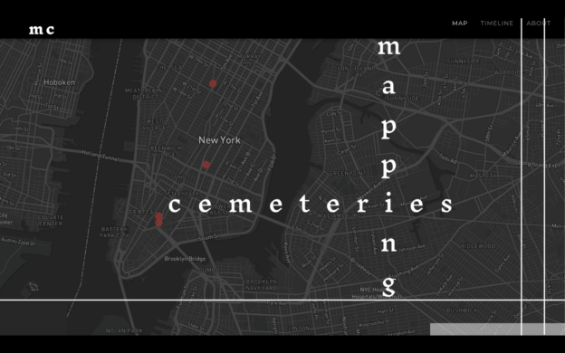
  Map An awareness of the global nature of the experiences of students.
  Submission Guidelines Content quality and formats.
  Outreach Invitation Letters Community engagement.

Class-based participatory activities.

Connection and commitment for students with the project.

  Certificates of Recognition An awareness of accomplishment for students. 

An awareness of gratitude on the part of the project team.

  Social Media Streams Increased public visibility and promotion of the content. 

Community building and networking.

  Presentation Increased visibility and awareness of the project objectives and content within the University community, other communities, and the audiences served by the project.
Cohort Team Project Plan Cross team insights on project planning
  Collaboration Agreement Cross team insights on collaboration tools and norms
  Data Management Plan Cross team insights on data ethics and data management tools
  Outreach Plan Cross team insights on social media strategies
  Blog posts Insights in role expertise, increased cohort morale through personal reflections
Audience

The main audience of Corona Chronicles is first and foremost middle and high school students. These students live and study in places located across the world. They make up both the contributors who submit works as well as other students who visit the website to learn about and experience the visual art, poetry, videos, and prose. A secondary audience is the general public which includes the parents, family, and educators of the student contributors and student visitors. Another segment of the general public which Corona Chronicles serves is the network of educational, social advocacy, and public policy professionals who make decisions that impact the lives of our main audience.

The audiences were contacted through a variety of channels and modes of communication in conformance with the outreach plan developed by the project team. This outreach included email, telephone, and word-of-mouth efforts to a range of educational institutions based locally, regionally, and internationally.

Technical Decisions

The technical decisions made by the team covered the of areas of:

(a) A CMS hosting platform

(b) A data management and repository platform

(c) Website technologies

(d) Multimedia authoring tools

(e) Team collaboration tools

The team’s decision making process was based on a team-oriented needs analysis which formed a key component of the project plan and the consensus decision making process defined in the team’s collaboration agreement.

CMS Hosting Platform

The team chose to leverage the Adobe Portfolio hosting platform. The decision was based on an analysis of the project’s objectives and technical needs, which concluded that the capabilities of specialized archival solutions, such as Omeka and Scalar, were beyond the archival needs of the project. In considering open source CMS platforms, including WordPress, the team determined that given the project time frame constraints, the importance of the project’s non-technical deliverables, and the skillsets of the team the best choice for the first version of the website was Adobe Portfolio.

Three features and functionalities of the Adobe Portfolio platform contributed to the decision:

(a) The ease of use for a target audience including young users 

(b) The capability to support and manage the content for a range of media formats

(c) The specificity of the design in displaying artist’s work that complement the artistry of the students’ submissions

(d) Budget goals

Data Repository Services

As described in the data management plan, the team chose Dropbox as the content and archive repository for the following reasons: 

(a) Enterprise level data redundancy

(b) Team collaboration features

(c) Budget goals

The team also chose Google Sheets and Google Forms for the initial data and content capture. For metadata standards, the team authored a data management plan, which defined the project’s metadata and the standards, norms, naming conventions, and rules for data management and preservation.

Website Technologies

The team chose Tableau Software for its map feature, which offers interactive functionality, data driven capabilities, ease of design and programming, and the ability to automatically update itself as new submissions come in through the Google Form into the Google Sheet. As part of the project’s outreach strategies and the website user experience design, the team leveraged Google Analytics. The team also leveraged a number of website software and hosting technologies, including Typekit, core-js, Letsencrypt SSL, and GoDaddy DNS.

Multimedia and Graphics Authoring Tools

The team chose a range of open source and proprietary content editing software. Criteria for selection included ease of use, robust feature set, quality of output, and budget goals. These tools and services included the GNU Image Manipulation Program (GIMP), OBS Studio, Adobe Premier, Adobe Photoshop.

Collaboration Tools

Additionally, the team evaluated a range of collaboration tools and selected tools based on the size of the team, learning curves, and budget goals. These tools included Gmail, Trello, Discord, Doodle Meeting Management, Google Docs, and Zoom Technologies Video Conferencing. The free tier subscriptions of these tools aligned with the budget goals of the project.

Challenges

The team faced the following challenges and special areas of concern:

(a) Content submissions workflow management. With the content submissions workflow, the challenges the team faced included enabling team collaboration of multiple versions of the Google Submissions Form. Since Google Forms does not support team collaboration, workarounds were devised to allow team members to undertake the tasks of the content workflow.

(b) Website content management, user experience design, and responsive design. With the website, since Adobe Portfolio does not support team collaboration, collaborative workarounds were also devised to enable changes to the web pages and processing of the content. The team also devised workarounds to meet the requirements related to the user experience and accessibility. Limitations that were addressed included cover images for embedded videos, the information architecture for and navigation paths between content exhibits, and the responsiveness of graphics for mobile devices.

(c) Submission and consent form. Based on initial user feedback, users faced challenges completing the consent and submission form. User feedback suggested that the length and wording was the source of the challenge. A series of revisions were made and evaluated by the team and project’s student advisors.

(d) Website accessibility. Given the results of the Wave Accessibility Tool, a number of issues prevented the website from being accessible for differently-abled people. After consultation with an accessibility expert, changes were made to add alt-text, closed captions, and increase contrast for text and hyperlinks.

(e) Multilingual support. To enable submissions by speakers of Spanish, the submissions and consent form was translated into Spanish. However, the team chose not to translate the Spanish language submissions in order to preserve the contributors’ intention and work. The work to translate the submissions and consent form into Spanish will serve as a starting point for the development of full multi-lingual support.

(f) User license agreement. The team researched user licenses and selected the Creative Commons International user license, giving special attention to the concordance with the consent and copyright agreement.

(g) Privacy protection. The team discussed and developed ways to protect the privacy and identity of its student contributors as follows:

  • Only the first name, age, and general geographic location of each student is displayed on the website. 
  • The contributors are only visible if they decide to share work that includes videos and pictures of themselves. 
  • The excel sheet with student email addresses can only be accessed by project members. 
  • The website accepts anonymous contributions. 
  • Personally Identifiable Information (PII) is removed from the submissions before publication. 
  • Privacy concerns are taken into account with the project’s student advisory board.
  • Only first names are included on the certificates of recognition. 
  • The submission guidelines encourage students to not display their school name/info within submissions.
  • The website’s map feature places its markers at a state-city geographic zoom level.
  • A cookie privacy banner is enabled on the website. 
Educational Impact and Future Plans

As a result of the project, the members of the team earned academic credit towards the fulfillment of the requirements for CUNY Graduate Center’s Masters’ and Doctoral Programs. The project was undertaken by the team as the principal requirement for the course Digital Digital Humanities: Methods and Practices, which as described in the course syllabus is “the second course in a year-long sequence of two, three-credit courses that introduce students to the landscape of digital humanities tools and methods through readings and classroom and online discussions, lectures offered by prominent scholars and technologists, hands-on workshops, and collaborative projects”. The completion of the initial version of the Corona Chronicles website also prepares the way for the second phase of the project, which has yet to be formally defined and may involve the further development of outreach, team collaborators, and ongoing student submissions. The project will also serve as a basis for a Master’s capstone project. 

Access/Contact info:

web: https://corona-chronicles.world/ 

email: [email protected]

instagram: https://www.instagram.com/coronachronicles.world/

5. Project Evaluation and Impact

In our Work Plan, we described our initial goals by saying: “In its final form, the archive will be a publicly available, easy-to-navigate website that displays a range of multimedia projects from students aged 10-18 (middle and high school).” In its current form, the project achieves each part of this stated goal with the exception of a definitional shift from conceiving of the project as an archive to a collection. The substantive aspects of the project that have changed related to the process behind how we reached our end goal. 

In the early stages of web development, our conversations evaluated the benefits of open source web hosting platforms, as well as free-for-student options that maximize multimedia capacities; access, mission consistency, and sustainability were central to our discussions. We determined that to build a project distinguished from parallel projects in the field, the optimal hosting site was Adobe Portfolio. While not an open access platform, we made this determination for three specific reasons: (1) ease of use for a target audience including young users (2) the capacity to support a range of media forms (3) specificity of design in displaying artist’s work to honoring the artistry of the student submissions. 

Consistent with our intentions to build multiple forms of accessibility into the site, our original outreach intentions included an emphasis on engaging students who may not otherwise independently access the archive due to a variety of technological or informational barriers. We imagined this to include providing filming and audio recording opportunities, however, as our scope narrowed, this was deemed outside of our capacities for this semester and will be revisited in the next phase.

Our outreach strategies began with personal networks and the creation of social media pages. We were successful in recruiting a geographically diverse student population within the United States, as well as a set of international submissions from Peru. Our team’s work with an after school program in Inwood made clear the importance of centering an ethics of care above a focus on sheer volume. We engaged in conversations on compensation and recognition of student work that informed how we defined the scope for this semester, as well as thanking students for their submissions.

Over the course of the project, our team learned several key lessons. First, an ethics of care was essential to the mission of the project as well as ethical conduct, particularly when working with minors. Erring on the side of not putting pressure on or over-extending our student collaborators and possible contributors guided us. 

Our work with student collaborators also reinforced a key lesson regarding audience: we are in collaboration with our audience and engagement with them starts at the onset of project planning and continues throughout, not just at the end. Overall, we recognized that one of the points of fear is also the point of opportunity – working with minors meant that we put enormous time into the consent form. The difficulty of getting this right was not a reason to give up on it; the messiness is part of the process and might never get fully resolved. Moreover, our team learned to make decisions and go with them and understand that we could take the risk of failing quickly and adjust accordingly if needed. 

Breaking away from the work plan led to useful new directions and connected back to an ethics of care. Within our team, this also extended to ensuring open, clear, and kind communication between team members.

6. Project Continuation and Long-Term Impact

The project will be maintained and expanded through the end of the 2021 calendar year. This timing aligns with the second phase of the project serving as a MALS digital capstone project, as well as the period through which we anticipate being able to solicit student reflections on the pandemic. The success of outreach efforts and the viability of the site maintaining new content will help determine the final end date of the project. While the original team of the Digital Humanities graduate candidates will continue to support the Corona Chronicles archive, the main administrators of the project will change in the next phase except for Karyn Delay will continue with the digital collective as her graduate capstone project. 

Corona Chronicles is a great example of the open pedagogical practice of co-creation between educators and learners. As such, the project can serve as a model to further this practice. With this in mind, during the next phase of the project taking place this upcoming summer, the team is constructing different possibilities to incorporate and engage more students as co-producers. While student advisor to Corona Chronicles Isabelle, might take this archive on as her senior project, another possibility might take the form of a Digital Humanities seminar or course at Karyn’s school . The team might also receive student input and support by a new group of selected student advisors. Having such as successful student involvement during the initial phase provides a good foundation to continue as a learner centered creation. More information on the various ways students will remain as partners will be determined after the end of the school calendar year and will depend upon student enrollment and availability through the end of 2021.

The first phase of the project revealed challenges to be addressed in the next iteration of the site. Those challenges may be broadly grouped into three categories: technical, outreach, and scope of the mission. With regard to the technical: our team will compile nd share documentation regarding processes that will allow a smooth transition. In this also considering a possible change of hosting site, one that is more sustainable and offers better support and space for multimedia contributions. In changing sites, commenting and other social features are being considered to further student engagement and global connection. Funding to support future iterations of the project will be sought through grant funding to cover software costs. Outreach to the next group of student contributors will be carefully planned to ensure a sustainable workflow over the summer months; summer and fall outreach will likely differ – students will be reached through different means at these times. At present, there are three additional branches of outreach currently showing promise: 1) a historical society 2) an individual school’s art department 3) a small group of individual students whose parents have provided consent to contribute. These three branches may serve as a model for future outreach: community-based organizations, individual schools, and personal connections. 

Moving forward, as schools reopen, our primary questions/prompts regarding virtual learning and life during a pandemic might change to fit the changing times while still providing a space for learners to express themselves in their ever-evolving surroundings. Another challenge that will arise as the project heads into the next phase has to do with scope. Our mission is global and as Corona Chronicle expands, so will the responsibilities to accessibility, privacy, and the maintenance of ethics of care. As the collection advances, the team will need to innovate to sustain community, educators, and student relationships.

The team will continue to create, solidify, and conserve relationships. This goal will be accomplished by incentivizing existing alliances between school administrators, educators, and community-based organizations. Social media, particularly the project’s public-facing Instagram profile, is a great tool to highlight student contributions while also forging new global connections. Another way to maintain communication with new and ongoing partners is through a newsletter. This one will be used to keep all parties aware of new developments, new partnerships, and celebrate milestones. The team will also form a strong and reliable crew composed of new and former administrators to be reached for consultation and collaboration.

Mapping Cemeteries

Mapping Cemeteries: Final Project Report

Group Members

Brianna Caszatt: Project Manager

Researcher: Cemetery That Was Repurposed as a Public Park (City Hall Park)

In her primary role as project manager, Brianna created a group space for everyone’s internal communications and workflow needs, she set the meeting agendas and kept notes during each meeting, and she made sure blockers were addressed and goals were met. She manages the team’s private group page and public site on the CUNY Academic Commons. For this first phase of the project, she was also responsible for researching and maintaining the data on a cemetery that was redeveloped and turned into a public park.

Lisa Kofod: Design and User Experience Lead

Researcher: War Memorial (General Worth Monument)

Lisa’s primary roles were site design and testing. This included working with the developer on which platform to use and what frameworks to apply, creating best practices for the incorporation of digital assets, and testing the site as it was developed. Their secondary roles were in documentation and research. Documentation includes tracking conversations during the development stage and encouraging the team away from scope creep. Research responsibilities included working on technical options and scholarly research on a set of war memorials within Manhattan.

Nadia El Mouldi: Development Lead

Researcher: Historical Cemetery Space That Still Exists as Such (New York Marble Cemetery)

Nadia was responsible for the web development and mapping effort. This included framework and tool selection, as well as implementation and testing. She was also responsible for a portion of the research and data collection, pertaining to historic cemeteries in New York City.

lane vineyard: Outreach Lead

Researcher: Cemetery Space That Was Repurposed, Later Rediscovered, and Exists Again as Such (African Burial Ground National Monument)

lane’s primary role for the project was outreach, which entailed the creation and maintenance of an online presence for the project (Instagram, Facebook, and TikTok). Additionally, they did primary research for the African Burial Ground National Monument that was showcased in this phase of the project.

Asma N.: Academic and Audiovisual Modulation Lead

Researcher: Hidden Memorial Spaces (Shoe-Hangings)

Asma served as a lead in academic research and audio production for the project. She also supported project outreach and is producing the limited series audio project, Mapping Cemeteries: After Life, about the lines that brought the team and our work together.

Project Narrative

Overview

Mapping Cemeteries is a digital humanist timeline and mapping project that explores the deathscape across New York City.

We understand a deathscape to encompass both physical and notional spaces recognizing all acts of care pertaining to death and memorialization. For this project, we used both a historical and a necropolitical lens to understand the city’s deathscapes, and to ask a fundamental question:  Who gets to be remembered after death? We began with Dr. Achille Mbembe’s definition of necropolitics as “the power and the capacity to dictate who may live and who must die.” With this definition in mind, we explored what roles the city has played (and continues to play) in determining how people die and who is remembered. We also used an infrastructural lens, acknowledging that infrastructure can enhance but also necessarily limits how people interact with it. In our research and development process we sought to understand how city policies and definitions of space affect our lived experiences of the city.

Cemeteries offer a rich perspective through which we can study New York City history. They provide evidence of changing traditions and practices of care, and we found more of an immediate and intimate connection to these spaces as they are so tied to people compared with other types of infrastructure and architecture. In these places, there is an inherent tension between remembering and forgetting, with both human memory and markers subject to erosion. Within a metropolis like New York City, its large population confined by a limited geographical area adds to this tension. A population of many millions necessarily requires the care of a larger number of dead, and it also means that the physical spaces allotted for the dead compete with the spaces allotted for the varied activities of the living.

Mapping is a tool through which we can examine places and their relationships to each other. Maps can also help us to find our location within the spaces around us. In this project, we used mapping as one way to put our locations in dialogue with each other, as well as to put New Yorkers in dialogue with the deathscape around them. But we acknowledge that mapping always leaves something out, so through our timeline we created a map that reveals aspects of the deathscape that have been hidden or overlooked, and we added layers to this understanding by linking text, images, and audio.

Environmental Scan

There is much interest in cemetery studies as it relates to personal genealogies and family histories. Companies like Digital Legacys sell brass squares with QR codes that can be affixed to a headstone and then direct the user to a personal legacy page, and projects like Billion Graves seek to document cemeteries throughout the world using GPS and crowdsourcing.   

On a local level, various blogging sites like Untapped Cities, Untapped New York, and Forgotten New York have documented the history of specific New York City cemeteries. But this project seeks to view cemeteries on a different scale and aims to position them in relation to and as part of the urban landscape in New York City. As a proof of concept, we focused on five types of spaces that showcase different facets of the deathscape:

  • a historical cemetery that still exists as such (New York Marble Cemetery)
  • a memorial that is hidden in plain sight (Shoe-Hangings)  
  • a cemetery that was repurposed as a public park (City Hall Park) 
  • a cemetery that was repurposed, later rediscovered, and exists again as such (African Burial Ground National Monument)
  • a war memorial (General Worth Monument)

Ours is not the first academic project to focus on the New York City deathscape. Previous Methods and Practices students and other local researchers have created New York City–centric projects that speak to the city’s deathscape:

  • Necropolis was a previous Methods and Practices course project. Working with the burial records of Shearith Israel’s Second Cemetery, the team created a thick map and timeline and put the lives of the cemetery’s inhabitants into the context of New York City between 1805 and 1829 (when the cemetery was active).
  • The Classical Tombs Project is directed by Dr. Shelley Hales, at the University of Bristol, and Dr. Elizabeth Macaulay-Lewis, at The Graduate Center (GC), City University of New York (CUNY). This project aims to explore cultural practices as evidenced through the architectural styles of prominent rural cemeteries in London and New York City.
  • The New York City Cemetery Project, created by anthropologist and museums and archives specialist Mary French, comprises archival research and a narrative snapshot for each cemetery, accompanied by historical images, newspaper clips, and snippets of maps, for approximately 350 cemeteries in the city dating from the colonial period onward. 
  • In her anthropology PhD dissertation for the GC, Dr. Elizabeth Meade sets about providing the most complete record of historical cemeteries in the five boroughs. She admits that her study is incomplete as it includes only cemeteries that were intentionally built and recognized as such. It is also based on the historical records available from the colonial period onward, and so excludes the burial activities of Indigenous people pre-contact. Furthermore, as record-keeping and preservation are timely and not without significant costs, much of the available records likely skew toward cemeteries and groups of European descent with means. Her dissertation presents the maps in segments (as a limitation of the size of the page), but she also has built a website with the full map.

Necropolis and The Classical Tombs Project were created as proofs of concept, limiting their initial phases to a small number of locations, just as we have. Necropolis was created with the help of cemetery records, which we knew we would not have access to during the COVID-19 pandemic. So our project has taken a very different approach to research. Furthermore, both of these projects are examining more prominent cemeteries that still exist as such, whereas Mapping Cemeteries has included memorial spaces that are hidden–either through redevelopment of the land or because not all practices of memorialization are recognized across different communities.

While the New York City Cemetery Project is a tremendous achievement offering a wealth of knowledge on the cemeteries therein, its blog-like presentation of the information does not easily allow for an examination of the cemeteries in comparison with one another or give an understanding of the physical spaces they occupy or occupied in relation to the city as a whole. And Dr. Meade’s deathscape is currently limited to a traditional, aerial-view map that includes little else of the city. Our project seeks to create a fuller user experience by sharing the deathscape through an interactive timeline, story scrolling, and audio narrative. While we began with five examples, future iterations will add more locations, and this will expand the conversation.

Audience

Mapping Cemeteries is a digital humanities (DH) project in conversation with academic and non-academic audiences who are seeking accessible text, visual, and audio resources that explore our complex relationships with death. Our audience can be seen as a pyramid:

  • ourselves 
  • our classmates 
  • the CUNY community 
  • the greater academic community studying deathscapes and necropolitics 
  • a more general, non-academic audience interested in New York City history 

With these audiences in mind, Mapping Cemeteries began its initial phase with the graduate students of the Spring 2021 DHUM 70002 Digital Humanities: Methods and Practices course (taught by Dr. J. Bret Maney) GC. Our classmates are individuals who self-identify as digital humanists, archivists, researchers, artists, and technologists. Our class had publicly posted their skill sets and interests to our class blog. Asma conducted a small textual analysis project (referred to as text mining in the literary and DH fields) using the data mining tool Voyant.

Word Cloud

Voyant world cloud created based on class skillsets.

The image above is a word-cloud image from that research project. (For the full analysis, visit https://voyant-tools.org/?corpus=703e77fa6a4c85bec112d79c526ccd76&panels=cirrus,reader,trends,summary,contexts.) After analyzing the Voyant data, we decided to focus on a novel site design and robust research.

We also created a secondary site on the CUNY Academic Commons named Making Mapping Cemeteries that documented our creative process via personal and group blog posts, and we created a special audio project further exploring our research and our journey together. We see next year’s Methods and Practices students and other scholars new to the DH field as a future audience who may be served through these additional resources.

Project Activities

Initial Goals

The initial goal of the project was to create two maps layered on top of one another. The bottom layer was going to show all of the cemeteries in New York City as they existed in 1820, including data about when they were built and what affiliations they had (such as religious, commercial, or public). The top layer was going to show them in 2020. The aim was to visualize cemetery obliteration and discover patterns among the cemetery spaces that were repurposed, as a means to ask questions related to urban planning, sustainability, and community building.

Reassessing Our Work Plan: Adjustments and Changes

The original project proposal for Mapping Cemeteries relied heavily on the research of anthropologist Dr. Elizabeth Meade. As a recent PhD graduate, Dr. Meade is working to expand her dissertation research into other personal projects. Understandably, she was hesitant to share her data with our student group. This felt like a major blow at the time, but in hindsight, it was the best thing to happen to the project as it gave us space to think about what we could contribute to this area of study. And it meant we did not have to balance another person’s schedule and expectations on top of our own.

Another major change happened when we refocused our audience to include ourselves and our class as the primary audience. In the early stages of development, it was easy to get caught up in thinking that we have to deliver a certain kind of final project and it had to be in its final spectacular form and ready for “primetime.” But we took a moment and realized that part of what we are delivering on for this project is the actual process of creation—it is not just about where we ended up, but very much about how we got there. This realization gave us room to acknowledge ourselves as the very first audience of the project and encouraged us to take time to think about how we could serve ourselves while building the project. This included being respectful of workloads, allowing room for fun and exploring tangents, and being flexible to change course when we encountered roadblocks.

All of the above led us to re-envision the project as a proof-of-concept focusing on five types of memorial spaces that we identified as representing different aspects of the deathscape across the city that each of us was interested in exploring further. And it gave us room to pick a specific location within these parameters that we were excited to research.

To manage all of the data we were finding and making, we developed our own data management workbook in a shared Google Sheet. Using the Tidy Data protocol, we designed this workbook to maintain consistency across all spreadsheets so that it would serve the needs of our developer and make it relatively easy for all of us to use. However, as the GitHub website was being built, we realized that some of our needs in the data management tool were changing, and we edited, redefined, added, and removed columns as necessary. We discussed the data management workbook in nearly every team meeting to make sure we all understood any changes and were all inputting our data consistently. This process worked well for this phase of the project, but if the project grows we will likely need to explore a different data management system.

Accomplishments

Even though we carefully addressed scope creep in almost every team meeting, we still managed to deliver even more for Mapping Cemeteries than we initially thought possible. The meat of our project and research endeavors exist on the Mapping Cemeteries site, built in and hosted on GitHub Pages. Through the CUNY Academic Commons, SoundCloud, and social media, we explore and make transparent the entirety of our process in building this project.

Map of New York City with 5 Points Indicated

The home page of the project, showing an aerial map of New York City with interactive marks for each of the five locations.

Decorative

The “Timeline” page of the GitHub site which has an interactive function that filters content based on the user’s interaction with its horizontal and vertical timelines.

Decorative

Each cemetery has its own page, which users navigate to through their interactions with the “Timeline” page or by tapping and opening a link off the home page.

Mapping Cemeteries on GitHub Pages

Site: http://mappingcemeteries.com/#/

Mapping Cemeteries (mappingcemeteries.com) is a website created using Vue.js (a JavaScript framework for building single-page applications) and D3.js (a JavaScript library for data visualization). The project also utilizes Vuetify, a Vue.js material design framework. The website is hosted on GitHub Pages on the custom domain name: mappingcemeteries.com. 

The user interface was designed to center both the individual deathscapes for each of the five cemeteries and their intersecting lines. This has been achieved through three main visuals:

  • The horizontal timeline was created using D3.js, CSS, and HTML. It includes dates of some New York City historical events that aim to position each cemetery within the city’s deathscape by adding each data point from the vertical timeline to the date it corresponds to on the horizontal one. Clicking a point on the horizontal timeline scrolls the user down to the corresponding vertical timeline data point (or card). We chose a simple monochrome “fishbone” design to allow the vertical timeline to stand out on this page.
  • The vertical timeline was created using the Vuetify timeline component. Each of the cemeteries has three “cards” on this timeline, each of which contains a “Read More” button that leads to the location page for more information. We chose to highlight the data points that fit within the larger deathscape and history of New York City and that each team member wanted to highlight as part of the larger relationship between all memorials. The cards include relevant images, quotes, and information crafted by each individual team member.
  • The location pages were also created using the Vuetify timeline component for design purposes; however, this was not necessarily organised in a chronological order, and it did not include date information. Each location page included more in-depth information on the specific location.

Our choice of user interactions made the above design more efficient:

  • Tagging mechanism: We implemented a way of tagging each data point in the vertical timeline with a minimum of three key words. These words capture the data point as it relates to the city’s deathscape and other cemeteries’ deathscapes so multiple data points can have overlapping tags. Clicking on a tag applies a filter to the vertical timeline so it only shows the data points tagged with the clicked tag. Some examples of these words are infrastructure, disease, reinterment, and park.
  • Interaction between the horizontal and the vertical timelines: the most notable part of this interaction is that it is bidirectional. Clicking on a data point on the horizontal timeline takes the user to the actual data point on the vertical timeline. Clicking the pin icon on a vertical timeline card makes the corresponding horizontal timeline data point stand out to the user through color and size change of the circle. The goal of these interactions is to create an interactive user experience that makes the navigation of our user interface components intuitive.
  • Gravatars: This was a design component that appears on multiple pages of the project, as a way to remind the user of the five different locations in focus and to frame the timelines as a conversation between all team members. A click on the gravatar links the user back to the location page it corresponds to.

We also included an extensive “About” component in the website to present our team, our purpose, and our own definitions of what Mapping Cemeteries meant to us. The “About” page links back to the Making Mapping Cemeteries website, as a way to encourage users to navigate to the companion website to learn more about the process and our research.

Our team was able to deliver a final prototype that reflects our vision for Mapping Cemeteries. Each page of the website mirrors the research that team members had put into their own location but also created a conversation with other members’ locations. We enjoyed making all the decisions that went into creating the website. For example, by discussing our individual locations during our team meetings and on one of our audio episodes, we were able to organically choose which data points to include in the vertical timeline and to craft the tags that put our locations into conversation.

Decorative

View of the home page for Making Mapping Cemeteries on the CUNY Academic Commons.

Making Mapping Cemeteries on the CUNY Academic Commons

Site: https://mappingcemeteries.commons.gc.cuny.edu/

We agreed very early on that we would create a CUNY Academic Commons group as our primary project management tool for all our communication and organizational needs. Our project has also championed transparency and pedagogy from the very beginning. The decision to then create a companion public-facing site for Mapping Cemeteries on the Commons was an easy one.

As a fun, self-reflexive exercise, we all defined the project individually and shared our answers together. It was fruitful to see how we all understand the project in the same but also in different ways, being particularly drawn to varied aspects of it. Mapping Cemeteries is not just one thing. We created a slideshow of our definitions as the landing page of the site to draw users into this conversation.

Indeed we’ve built almost every page of the site with user engagement in mind. We’ve enabled the Hypothesis collective annotation tool on almost every page of the Commons site itself, so users can comment on any page. We also have a reading list in progress, links to which we’ve shared via Hypothesis when possible in order to engage users to annotate along with us.  These exercises in collective reading have influenced our work thus far and have helped us to think about death in New York City and in places beyond the scope of the project’s initial phase.

We enabled commenting on all of our blog posts. Over the course of the semester we created so much content about the project for the course blog. We’ve repurposed much of this into this site blog so that the content is more closely tied to and in conversation with the project in all of its facets—on GitHub and also on SoundCloud and social media.

We’ve also provided users with access to our full working bibliography of sources via Zotero. And in the immediate future we will provide a list of all of the tools we’ve used to build the project. We had so much fun creating the horizontal timeline on GitHub, though we had to limit ourselves to very brief data points to fit on the page. So we are also looking at ways we might expand this timeline on the Commons site. Lastly, this paper itself will be given prominence on our Commons site.

Decorative

View of Mapping Cemeteries: After Life on its SoundCloud page.

Mapping Cemeteries: After Life on SoundCloud

Site: https://soundcloud.com/mappingcemeteries

Mapping Cemeteries: After Life is a three-part, limited series audio project and record of our collaboration that can be understood as a miniature podcast.  Hosted on SoundCloud, it was produced by Asma, our audiovisual modulation lead. It was imagined as a pedagogical and introspective undertaking that acquaints the audience to the team behind the Mapping Cemeteries website. After Life enlivened our collective work and outreach to our audience, increasing our project’s reproducibility.

A salient project theme is ‘scape’ (or space), and it was emphasized in the introductory episode, “What Lines Brought Us Together” through sound mixing, an area of audio editorship that manages the quality of a track. For example, a dreamy ebb-and-flow of one voice into another with slow and bassy backgrounds can be heard in this episode, which purposed the fields of our deathscapes as transitions, a metaphorical signal about passing on. GarageBand, a Digital Audio Workstation (Apple Inc.) was used to sound mix (and produce each episode).  Sound mixing exposed a methodological outcome that underscored our introduction as one about a collective narrative and our project’s priority of embodied spaces.

We used field recording, another methodology of sound, to produce episode two, “Our Deathscapes,” which complements our timeline in an alternative and audible learning style. Field recording is the collection of sounds unique to a space and it is commonly used in humanistic research such as anthropology. Each team member asynchronously recorded their voiceovers and respective locations using a recording device or a voice application to sample and/or create sounds relevant to their deathscape.

“Our Deathscapes” is also a compartmentalized episode where each deathscape is isolated to a track of its own for digital embedment on respective areas of the timeline. Our audience and listeners are able to disaggregate their listenership, which harkens to the aforementioned enlivenment that we believe benefited Mapping Cemeteries as a project and our audience. After Life was a contextual and reproducible approach to documenting the lines that constitute our collaboration and deathscapes.

Decorative

Definitions of Deathscape and Necropolitics, representative of our posts on Instagram and Facebook.

Mapping Cemeteries Outreach and Branding

Instagram: https://www.instagram.com/mappingcemeteries/

Facebook: https://www.facebook.com/mappingcemeteriesnyc

TikTok: https://www.tiktok.com/@mappingcemeteries?lang=en

After team deliberation on which social media sites would best facilitate our initial plans for outreach, we settled on Instagram, Facebook, TikTok, and SoundCloud. To cater to our intended audience of classmates, CUNY members, academics, and fellow digital humanists, our outreach plan prioritized pedagogy and overall reproducibility of Mapping Cemeteries. Instagram and Facebook posts spotlighting the cemeteries our project focuses on and definitions of crucial topics explored in our research prioritize pedagogy, while posts informing viewers on field research methods prioritize reproducibility. 

Post ideas were brainstormed during weekly virtual meetings between lane and Asma and then compiled in the outreach team’s work plan system (WPS) that was maintained on Google Sheets. Additionally, images that visually captured elements of our research topics and areas of interest were submitted by the team to help with the overall post creation process. The outreach team initially worked toward a six-week plan that included weekly to biweekly posts across each chosen social media.platform. A total of nine posts have been published on our social media accounts: seven image and text posts on Instagram and Facebook, and two videos on TikTok.  

Multiple brainstorming sessions, both synchronous and asynchronous, led to the development of a fleshed out outreach plan boasting a lengthy catalogue of posts and potential ideas. It is clear now that six weeks was not enough time to touch upon all of the topics initially planned for outreach. Thus, outreach for Mapping Cemeteries will extend into the summer. 

In terms of branding, evaluation of overlapping themes in research and visual elements that we felt captured them produced several logos that we have implemented across our social media accounts, Commons site, and GitHub site. While the plan was to have a single logo be representative of our project, the unique input from each team member led to multiple logos that share commonality in terms of visual elements such as font and color, but also vary to fit the overall theme or aesthetic of each platform that it is housed on. 

Evaluation

Mapping Cemeteries was evaluated by many different people throughout the project build, and it is a much stronger project now because of it. We are so grateful to Dr. Maney and Micki Kaufman (MA in Digital Humanities program advisor) for joining our breakout rooms and team meetings and providing feedback throughout the course. Their mindful questions helped us address blockers, such as when our initial collaboration plans fell through.

Dr. Maney reviewed both our GitHub-hosted site and Making Mapping Cemeteries. He provided us with useful feedback from a user perspective. Part of the feedback was relating to usage and user interactions. The rest was related to the content of our research. This exercise was particularly useful because having worked on the website for a few weeks, our gaze has grown accustomed to the design. However, Dr. Maney’s comments allowed us to take a step back and realize some of the implementation issues. For example, we were able to adapt the splash page to smaller screens without losing the functionality and also to correct the wording for some of our text cards. 

Brianna was in contact Lisa Hirschfield (fellow MA student in the program who led the Necropolis praxis project), and she provided much guidance and reassurance early on about what it’s like to build a DH project and was available to discuss tools her team used to build Necropolis that may be of interest to the Mapping Cemeteries team.

Asma consulted with CUNY’s Distinguished Professor of Philosophy Dr. Jesse Prinz to discuss the ethics of their deathscape in the public domain. Dr. Prinz provided guidance about contextualizing City Shoe-Hangings as a discussion that should reconsider the human experience. It informed Asma’s approach to discoursing death through text and audio for Shoe-Hangings.

Lisa had several non-academic users review the GitHub site. They provided feedback, and especially enjoyed the interactive aspect of the timeline page. 

While lane did not receive any individual evaluation, tips on best practices for both research and outreach were gathered through lecture visitors like Dr. Lisa Rhody and Micki Kaufman. Feedback in the form of comments and reactions to social media posts from both fellow team members and classmates were also impactful and validating.

Presenting at the GC Digital Showcase

Preparing for the GC Digital Showcase was a stressful but ultimately very rewarding experience. It was difficult at first to figure out how to distill all of our work over the semester into five minutes. We also wanted to balance and highlight every team members’ contribution to the project, which is again hard to do within such a short span of time. Thankfully there were many opportunities to practice and receive feedback from both classmates and outside audiences, including Javier Otero Peña (MS in Data Analysis and Visualization program advisor). Brianna altered our presentation after each practice session, as our audience helped us to see which parts of the project were the most tantalizing.

The reactions we received after the Showcase were so positive. People have been excited to share with us their favorite cemetery spaces and their relationships with them, and many people have expressed to us that they are thinking about these spaces differently now after viewing our project.

Future Evaluation Form

We had originally hoped to create a Google evaluation form to solicit more information and feedback from our classmates before the GC Digital Showcase. However, we realized that timeline was not realistic for us or our classmates. Instead we are working on a form to send out to them in early June. As we are all still interested in working on this project in some capacity moving forward, we think their feedback will be of real value to us.

Based on how this assessment goes, we will consider including a similar form in the Making Mapping Cemeteries website, perhaps in the “Contact Us” page.

Future of the Project

Our team is so proud of the work we’ve done on Mapping Cemeteries, and we are all interested in continuing work on it in some capacity beyond the Spring 2021 semester. However, we also acknowledge that this semester has been a lot of work, and we are all in need of taking at least a short break so that when we return to the project we can look at it with fresh eyes and renewed excitement.

Brianna is considering how to turn Mapping Cemeteries into her capstone project. We have discussed ways we may continue as a team, including adding to our existing research and adding new locations to the project—either ourselves or by finding more collaborators. We still have so much to explore within the New York City deathscape, and of course there are deathscapes everywhere there are people, so there are lots of spaces to be explored around the globe.

Even in its current state, we see a bright future for Mapping Cemeteries. All of our code is available on GitHub for anyone who wishes to build their own version of the project. And, especially through our Making Mapping Cemeteries site and After Life audio series, we believe we created a valuable resource for future Methods and Practices students and people wanting to learn how to build a digital project.

In the short-term, we have agreed to record at least one more installment of our audio series. We also intend to create a walking tour using The Clio (a digital tool), and continue our outreach via social media.

Recording Bonus Episode of Mapping Cemeteries: After Life

The epilogical “After Life” episode will document the final reflections about our site’s timeline debut from members of the team and wider CUNY and New York City communities.

Creating a Walking Tour on The Clio Site

As part of our desire to bring a more general audience to the project, we plan to create a walking tour of our locations: starting at City Hall, then on to the African Burial Ground, the New York Marble Cemetery, and ending at the Worth Memorial with discussion of the hidden memorial as we go. 

We found an existing platform, The Clio, that was originally developed as a DH project and then received funding to incorporate as a non-profit. Users can build walking tours, virtual tours of museums, hiking trails, and a few other options. It has augmented reality for navigation (users see an arrow that points them along the walk) and is built for simplicity. It is cloud- and app-based, so all of the “tech” stuff is automatic—once created user options include downloading for offline use, converting the tour to a shareable PDF, or using augmented reality. We’ve reached out to the administrator for The Clio, and they have approved our using the platform to create a tour. 

Ongoing Outreach Plans

The outreach plan for Mapping Cemeteries will extend into the summer with weekly to biweekly posts on our Instagram and Facebook accounts along with the potential for additional TikTok videos. In our outreach plan’s WPS sheet, we compiled a lengthy list of ideas for social media posts, each crafted around our outreach goals of reproducibility and/or pedagogy. Another document houses a compilation of photos that visually capture elements of our project that we would like to showcase in our social media, such as images of intersecting lines, cemeteries throughout the city, and visualizations of both life and death. Posts sharing snapshots of information on our project’s cemeteries are an example of how the outreach plan will continue its efforts to promote our project and draw traffic to the site. 

Works Cited

Mbembe, Achille. “Necropolitics.” Public Culture, translated by Libby Meintjes, vol. 15, no. 1, Duke University Press, 2003, pp. 11–40. Project MUSE, http://muse.jhu.edu/article/39984.

“Clio – About.” Clio, https://theclio.com/about. Accessed 18 May 2021.

“Digital Legacys.” Digital Legacys Celebrate Life with a QR Memorial, 2021, http://digitallegacys.com/.

Elmayan, Lara. “Daily What?! There’s a Quaker Cemetery in Prospect Park with 2000 Gravestones.” Untapped New York, 28 June 2013, https://untappedcities.com/2013/06/28/daily-what-quaker-cemetery-in-prospect-park/.

Fiedler, Elizabeth. “QR Codes For Headstones Keep Dearly Departed Close.” All Things Considered, NPR, 29 Sept. 2012, https://www.npr.org/2012/09/29/162011967/qr-codes-for-headstones-keep-dearly-departed-close.

Matyszczyk, Chris. “A QR Code on Your Gravestone? It’s Dead Serious.” ZDNet, 20 Oct. 2020, https://www.zdnet.com/article/a-qr-code-on-your-gravestone-its-dead-serious/.

“You Searched for Cemetery.” Forgotten New York, 18 May 2021, https://forgotten-ny.com/search/cemetery/.

Young, Michelle. “Daily What?! Burial Vaults Discovered Under NYC’s Washington Square Park.” Untapped New York, 5 Nov. 2015, https://untappedcities.com/2015/11/05/daily-what-burial-vault-discovere-dunder-nycs-washington-square-park/

NYC Community Fridge Archive (NYCCFA) Project Final Report 

Project Narrative

NYC Community Fridge Archive preserves the histories of local community fridges installed in New York City facing food insecurity during the COVID-19 crisis. This project was created with the goal of building a comprehensive historical record of solidarity fridges, as an example of community mutual aid initiatives during the pandemic. As a public archive it will provide primary sources to future academics and the public about the communal response to the pandemic, food security, infrastructure, and any themes that historical distance might reveal. The archival materials and oral histories collected by NYCCFA highlight the voices of the community that built around community fridges during the COVID-19 pandemic, providing a space where participants can share their perspective and experiences directly. This direct access and open space ensure the representation and preservation of the diversity of community fridge communities. It serves as an antidote to media narratives which during the pandemic have focused narrowly on the role of the anarchist collective that started the first community fridge. The archive also promotes the community fridges as an accessible source of information for the public.

Community fridges originated as a way to combat food waste. Reflecting the need of many communities around the world, these fridges have become a source of mutual aid for communities helping each other. In February 2020, an anarchist community A New World in Our Hearts initiated the use of a community fridge to share New York City’s extra food with those in need. Many local communities across the city, after that model, have implemented their own fridges (amounting to over 120 in the New York metropolitan area as of May 2021) to provide fresh, free food to their communities amidst the pandemic inflicted food scarcity. Beyond food, these fridges have been providing places for locals to come together and heal through literary and artistic activities in enduring communities they have organized. We see this community-based practice around NYC community fridges as a new form of activism arising in the city and our digital archive thus strives to collect and represent visual, oral, and otherwise textual histories of that resistance.

 Our project is first and foremost to assist precarious local communities in preserving their histories and to create a playbook for building a community around food security. To do so, our archive will emphasize relationships between people that form a collaborative structure of a digital humanities project. With that goal, we used the open-source platform Omeka which can display an interactive map to each fridge’s information. Our website serves both as an archive and an ongoing platform to further support solidarities and memories surrounding NYC community fridges.

Community fridges continue to grow in number and attract more attention, but there are no public efforts (in NYC) to build an archive or an oral history project similar to the Community Fridge Archive. Through our outreach efforts, we learned about the Organizing Resource Library, a free and fully accessible digital library and an archive of mutual-aid organizing tools —created for, by, and in collaboration with mutual aid organizers across New York City. We have established a relationship with the Organizing Resource Library in the Spring of 2021 and we plan on joining their meetings and collaborating more after the end of the semester. Our search for projects similar or related to the Community Fridge Archive will continue as the archive grows. 

Audience

The primary audience for the NYC Community Fridge Archive are the communities that have been built and growing around the fridges. These communities include the people who use the fridges; the organizers, activists, and volunteers that stock and maintain them; and the restaurants and business owners that donate food, electricity, and/or other kinds of services and materials. The NYC Community Fridge Archive is a way for them to showcase their collaborative work for community building and preserve their memories from that process. The strength of this audience is that these communities are already built, active, and dedicated to community fridges. Their passion for their projects and the community has already been demonstrated by a large number of contributions that have already been sent to the archive. 

One of the challenges for the project ahead is to ensure easy access to the archive and participation from members of these communities who are not often reachable or active on social media. One important limitation to consider is that not all of the people who use and maintain community fridges have a high-speed internet connection or powerful computers. To facilitate the participation of these communities, the archive can be accessed via smartphones. Another limitation for community participation is that, for many fridge users and volunteers, English is a second or third language; in the future, the archive will solicit community help to allow contributions in any language, and possibly create a version of the archive in Spanish, which is the second most spoken language in NYC. This language diversity will also serve as a way to involve the community, creating a new space for collaboration and helping to ensure the longevity of the archive. 

The second target audience is the ecosystem of local nonprofit organizations in New York City. Nonprofits would benefit from a comprehensive map of community fridges, to share the information with people in need and point them out to resources in their neighborhood. The advantage of this audience is that they already have a mission to help people; this, combined with the fact that nonprofits already have a community they serve, makes them the right partners to promote the NYC Community Fridge Archive. 

The public nature of the archive will also be a ready source for future historians and will encourage the NYC population at large to research the historical importance of the unprecedented moment of Covid-19. As a historical document for future research, this archive presents a tremendous resource for historians and other academics to study the Covid-19 crisis, the social infrastructure around the pandemic, and the community fridges in particular. The NYC Community Fridge Archive will serve as a repository of an important moment of communal challenges and resilience in NYC history, and it could help other people start their own mutual aid initiatives in their neighborhood. Moreover, the archive could be used by educators to teach about local history and involve students in contributing to the repository and conducting oral history projects.

To this end, our research and outreach campaigns focused on the communities that built these fridges. The community fridge network (local and global) is a completely grassroots effort, so we took advantage of this ‘openness’ and inserted ourselves directly into the fridge communication channels while labeling ourselves as grad students. While positioning ourselves as students was effective and safe, it didn’t make us appear urgent in our request for their contributions to the archive. On multiple occasions, our audience expressed to us that they were a busy population which made us create as brief and direct communications as possible both over Email and social media direct messages. We were also advised to speak with real fridge organizers early on in the semester to discuss their needs before we built the archive. 

This outreach mostly took place during the month of March, and at that time we learned that it is possible that we might not gain much attention for the reasons that not everyone likes academics and not everyone wants their memories to be preserved digitally. (Even worse, it was possible that we are thought to be just another mapping project of community fridges!) We had also discovered that many fridge users or ‘grocers’ might be undocumented immigrants and other sensitive populations so we thought that it might not be so wise to share the images of fridge users on our social media profile or to feature them in our archive at all. For the most part, we avoided spotlighting any grocers in our outreach campaign and focused instead on the information that was already publicly available. We left it entirely in the fridge communities’ hands to identify themself as we came to understand their values of privacy. The NYC fridge community is an extremely strong group of people who seem to go above and beyond to feed the hungry of NYC and beyond, but most of them also protect their grocers’ identities. (Please note that this is not the case for all fridges, but for most.) 

Project Activities

1. Overview  (Elena and Lola) 

In terms of project management, the NYC Community Fridge Archive team was able to accomplish nearly all of the goals we had set in our Work Plan. The only component we had to leave out was Phase 3 of our Outreach Plan: we had planned to have one community initiative a month, such as a Photo contribution campaign on social media for March, and a yoga lesson that would serve as a fundraiser for April. Our Launch party and Collaborators Appreciation Day was initially planned for May, but the team decided to move it to Sunday, June 6th to focus on our finals, wait for CDC guidelines about outdoor meetups, and to avoid Memorial Day Weekend.

As mentioned above, we were able to achieve the goals we had set for the project. However, this does not mean that we achieved them in the order or in the timeline we had initially envisioned. The first phase of the project was much slower than we thought, and the final phase happened much faster.

To elaborate more on this, Phase 1 of Outreach was Community Outreach: creating relationships with community fridge organizers, volunteers, donors, and grocers and meeting with them on Zoom to learn what affordances and functionalities they would like to see in our archive. We managed to meet with organizers and volunteers from five main community fridges or groups of fridges:

  •     Fort Greene Community Fridge (Brooklyn)
  •     Astoria Community Fridge (Queens)
  •     South Bronx Mutual Aid (Bronx). This organization manages the Anchor Fridge, the Isla Fridge, the Nuestra Nevera fridge, and Da Peoples Pantry.
  •     North Brooklyn Fridges (Brooklyn). Organized by North Bronx Mutual Aid, they manage the Greenpoint Fridge and the Cooper Park Fridge
  •     Forest Ave COMEunity Fridge (Staten Island)

During our meetings with the fridge community, we were able to talk about our project, its main goals, and the affordances of Omeka. Then, we asked the organizers and volunteers if this project could be relevant and/or helpful for them, what features they would like to see in our archive, and if we could thank them by organizing fundraising events for them. These conversations brought our project into the community, gave us a realistic perspective on its inner workings, and led us to discoveries we hadn’t considered at the beginning.

Our first discovery was that all of the fridges organizers while thanking us for the thought, told us that they didn’t need money or fundraisers. This is because most of them are already well-established within their local community, and they receive enough donations to defray the expenses of fridge cleaning products, repairs, and foods if there is a lull in donations from grocery stores and delis. Moreover, most of these fridges are managed by individuals, oftentimes from their personal bank or Venmo accounts that have been dedicated to their community fridge. This means that they cannot go above a certain amount of donations for fear of incurring taxes and bureaucratic headaches. Learning that the fridge organizers didn’t want us to fundraise for them meant that we made a collective decision to not hold community events of this kind – hence the cancellation of part of our Outreach plan.

The second thing we discovered is that beneath the joyful surface we see on social media and the press, community fridges experience challenges, vandalism, and conflicts with other mutual aid organizers due to disagreements on how to conduct their operations. This last discovery was the most problematic to us: one of the fridge organizers revealed that organizers from another fridge in the same areas were sexually harassing her female volunteers, fundraising in their name and keeping the money, alienating them from their donors, and vandalizing their fridges by filling them with non-allowed items such as unpackaged meat, spoiled vegetables (both of which are a health hazard), and unlabeled food (which could cause allergic reactions). Moreover, we learned that the members of an anarchist organization, which has had a lot of visibility on social media, online media, and the community fridges chats, had been manipulating people, gaslighting who dared to speak up about these issues, and harassing them into silence. After this conversation, the team was in a state of shock, and we all felt very naive for not predicting the complexity of the issues that come with a large, decentralized movement where people might have conflicting ideas about what mutual aid is (and, sometimes, not the best intentions). 

In the general meeting following this conversation, the NYC Community Fridge Archive team decided on a series of resolutions:

  1.   As an archive that aims to represent all the fridges, we would not erase the bad actors from our database. However, we decided not to engage with these people in our outreach efforts and not to feature them on our social media channels: we did not want to give more visibility to organizations and individuals who had demonstrated abusive behavior in an otherwise caring and hardworking community.
  2.   Following our commitment to represent the authentic stories of the NYC community fridges, the team agreed that the Archive needed to be a platform where organizers, volunteers, grocers, and donors could share not only their good memories but also their challenges and their frustrations. On social media, the tone that fridges use needs to be positive and uplifting because they need to promote their initiatives; however, this prevents them from telling the whole story. The team decided to provide the fridge community with space where they could tell their stories in their own voice, without shying away from the ugliness, the challenges, and the internal issues they face if they decide to do so. We would not be guilty of sugarcoating or whitewashing.
  3.   Finally, pursuant to the feminist ethics of care that guides our work, the team members decided to look inward and practice self-care in the aftermath of this difficult conversation. We started to check in on each other to make sure we were all ok and safe, since dealing with these issues of harassment and abuse had been triggering for some of us.

As it was mentioned above, the final part of the project went much faster than we had envisioned. We were worried that not enough people would contribute to the archive and that it would look like an empty shelf, or better, an empty fridge. However, after our first contribution – a photograph of the Chelsea Fridge which was uploaded on April 19, 2021 – the community started warming up to the idea of having an archive where they could share their stories. As of May 14, 2021, we have received 57 contributed items: most of them are photos of fridges, artwork, and volunteers, but we also have audio recordings of people’s memories, flyers, magnet designs, a mission statement, and a press release.

2. Outreach (Allison) 

When we first created the NYC Community Fridge Archive’s social media profiles (especially, the Instagram account), the last thing that any of us expected was the backlash. To elaborate on this issue, as early as mid-February we began following, liking, and commenting on other fridge Instagram posts while not having our own social media account with content; nor have we built up our Omeka website yet. We later found out from one of the fridge organizers that this gave the greater fridge community the wrong impression of us! We were thought of as being associated with In Our Hearts and even worse some folks suspected that we were the Mott Haven Fridge basically posing as a catfish. Luckily, we found this out pretty early on (as mentioned above), which forced our hand in mostly slowing down our Instagram outreach strategy. On the flip side of things, at least we got noticed! Regardless, this made us pause on engaging with fridges using social media until we had a better grasp on what the fridge community actually needed, so most of the Instagram posts are dated from late March to early May. This also created more of a focus of our team using email as the first and primary point of professional contact as much as we could and opted to not include much of our personal contact information within email communication to respect all of our privacy. The impact of our fridge being misunderstood also forced us to change the language that we were using to be more inclusive and to state that we have no involvement with any anarchist organization.

As time and outreach went on, we learned that fridge organizers are very busy and that they might not have a lot of time to focus on their emails with us and contribute to the archive. This encouraged us to tighten up our email campaign to be short and friendly and to create more social media posts that were thoughtfully planned (fridge cuisine types, celebrating specific fridges and artists). We tagged individual fridges, artists, and volunteers in our posts, which was effective in engaging the community in a holistic way. We also decided to go out into the public and meet the literal fridges themselves, which had not been in our original outreach plan. Luckily, we were able to catch some fridge organizers and volunteers in person on several occasions and inform them about the archive. We were also able to capture special moments of real people donating to the fridges which served as great social media posts and helped us gain trust from the fridge community. We were mostly met with enthusiasm and interest from our interactions, but only one of these in-person meetings (the East Village Neighbors fridge) led to a meaningful contribution to the archive. For the fridges that we met with in person, we did give them a little bit more follow-up than the others after our in-person meetings. While it is disappointing that most of these folks did not directly contribute any media to the archive (yet), these conversations were still illuminating and impacted our project in a positive way.

3. Our Web Pages (Montage)  

There were two products designed for the archive: 

  • Homebase page at the CUNY Commons for presenting the project 
  • the archive website built on Reclaim powered by Omeka Classic and OHMS. 

While building the homebase page on the Commons was fairly straightforward, the archive took several turns. First of all, we did not initially have our Reclaim account, so I started building the archive on my personal website. The initial installation was successful. However, several plugins, most critically the Contributions Plugin, which would enable user submissions to the archive, did not install properly. After consultations with the GC Fellow Stefano Morello and several advisors at my hosting site, it became clear that this was a server-side issue. At this point, The Graduate Center made our Reclaim account available to us. On Reclaim, I initially installed Omeka S, which may seem like yet another mishap, but it made even clearer how critical the affordances of Omeka Classic were to our purposes. First of all, while Omeka Classic has a user-friendly interface that presents the contents of the archive in a form similar to a portfolio website, Omeka S has a more classic library catalog interface even on the user side.

Being that our archive is a community-facing website, it was clear that this interface would not serve our purposes of attracting a wide range of audiences. Secondly, Omeka S does not support as many plugins and at the capacity that Omeka Classic does, so we made the switch to Omeka Classic. The technical support we have received from Reclaim regarding backend issues has been of critical importance. Affordances of tools and technical support are important considerations in DH projects as our process also has shown.

In addition to building and installing the archive website and its components, we needed to make decisions regarding organizing our data and selecting its metadata. We held several group meetings to decide how to categorize our data, and how we would adapt the DublinCore Metadata which Omeka utilizes. Even standardized terms or terminology may communicate different things depending on one’s audience, so this proved a bit challenging as we wanted to be as accurate and communicable with our metadata and categorizations as possible. Final feedback from Dr. Bret Maney made it clearer how complex this issue is as he pointed out that the language we used (that which was provided by Omeka) for data categories on our website such as ‘Collections’ and ‘Items’ could be replaced with more user-friendly ones. We plan to therefore replace them in the future, having an archive with a sophisticated organization yet is communicable and user friendly. These are potential contributions to the field of libraries and digital archives as we achieve such functionality.

4. Writing/Editing the Documents (Andy)   

As a writer and editor in the team, I contributed to the project at its various stages by composing and editing the texts that map out the plans and document the progress of our project. In addition, I oversaw the texts that were used in communicating with fridge organizers and grocers to modify possible linguistic or ethical issues. For the accurate documentation of our group work process, I transcribed our team’s meetings (for most of the weeks) and collected responses to the team’s in-class and public presentations. Additionally, I edited the entire text of this final report of this project. 

The work ethic of my writing and editing for this particular project has been in line with the team’s purposes/activities of generating this archive in working with the precarious public in these sensitive times. Rather than being creative or aesthetic with language, I did my best to keep the facts as they are (even the texture and nuance of the conversations) from the team members or our archive contributors and other audiences. However, for the formal documents required in the class, I sorted out our dialogues and drafts to make them clear to the readers (the professor Dr. Bret Maney and the rest of the class members, as well as the GC DH community and beyond).        

Accomplishments 

As mentioned above, two products were designed for the archive:

A screenshot of the homepage of the NYC Community Fridge Archive on the CUNY Academic Commons. There is a title, some intro text, and a podcast episode

The archive website is powered by Omeka Classic, which allows for multiple plugins and easy interface navigation for both site administrators and users. Site development and installation required managing the website at the backend and from the admin interface. Because of the easy use of the admin interface, the admin tasks ran smoothly as it was possible to easily figure out functions by following simple tutorials, the information provided on the Omeka Website, or intuitive exploration. Backend issues, which included uploading and configuring files via the CPanel, sometimes were smoothly resolved as I could resort to my own knowledge or search for answers on the web. Where further assistance was needed, Reclaim Hosting has been responsive and helpful regarding any questions about the backend issues. 

The admin interface consists of a dashboard, which allows for viewing and configuring the Items, Collections, Item Types, Tags, Exhibits, Simple Pages, Guest Users, User Profiles, Contributed Items, Map, CSV Import, and OHMS Import – all of which are enabled by plugins. The website appearance and settings can be configured via a menu displayed at the top of the page. Included in the Settings are those for DublinCore Metadata- the metadata element set can be reordered and customized via Settings.

A screenshot from the Omeka Admin page of the NYC Community Fridge Archive

The user end/website has a home page that displays information about the project, a Featured Item, Featured Collection, and Featured Exhibit which rotate on a random basis. Recently Added items also are displayed on this page. Users can sign up for the website via the Register function. A menu allows for navigating across the other sections of the website: 

  • Browse Items: all items added or contributed to the archive are displayed here. Clicking on ‘Browse by Tag’ displays a clickable tag cloud from which the user can select. Clicking on ‘Search Items’ displays an advanced search interface that allows for searching via multiple keywords and specific fields. Clicking on ‘Browse Map’ displays all items mapped out on an OpenStreetMap of NYC. 
  • Browse Collections: all collections are displayed in either alphabetical (Title) or chronological order (Date Added).
  • Browse Exhibits: each exhibit represents a borough, thus clicking on each one displays a map of the fridges in the borough. 
  • Contribute an Item: this section allows users to contribute items. A mini-tutorial/guide is displayed, alongside the options for the type of item to contribute. The item types the NYCCFA has made available are Fridge Memory (in text form); Image File; Audio File; and PDF Document. Once the user selects the type of item they want to contribute, a form comes up for each item type selected, that has fields such as title, date, name of the item, and the fridge; the user is given the option to provide their name and affiliation to the fridge, a file upload button, and a map interface to place the item on the map. The users are required to read the Agreement to the Terms and Conditions before they can submit their contribution.
  • Map: a map displays all items added or contributed to the archive. The items can be browsed by tag or the keyword form entering keywords or selecting specific fields.
  • About: this simple page displays short bios of the NYCCFA team and links to the NYCCFA social media accounts.
  • Oral History Gallery: this gallery displays the oral history items imported via OHMS.

a screenshot of the homepage of the Omeka site for the NYC Community Fridge Archive

The plugins:

Currently, 21 Plugins are installed on the website and we have thus far utilized the Contribution, CSSEditor, Dublin Core Extended, Exhibit Builder, Geolocation, Guest User, Hide Elements, OHMS Import, OHMS Object Plugin, PhillySimpleGallery, Record Relations, Simple Pages, Social Bookmarking, and User Profiles plugins. The plugins are accessible via a menu from the admin end and some of them can be configured after installing. 

Plugins that enabled core functions of NYCCFA include:

  • DublinCore Extended: this Plugin “adds the full set of Dublin Core properties to the existing Dublin Core element set”.
  • Contribution Plugin: This enables user contributions by providing a form-based interface. Once a user submits a contribution, due to our configuration, the item awaits admin approval. Upon approval, it gets displayed as part of the archive.
  • Geolocation Plugin: This enables items to be displayed on a map as configured by the admins.
  • OHMS Plugins: the Oral History Metadata Synchronizer, developed by the Center for Oral History at the University of Kentucky, enables transcripts, text level search, and thus advanced discoverability to oral history items. 

a screenshot of the Plugins page in the backend of the Omeka site for the NYC Community Fridge Archive

Evaluation

Social Media/Instagram

Allison has evaluated the impact of social media and email communications in a few ways. For email, we measured the number of direct email invitations vs total contributions. We tracked this alongside our fridge dataset which resulted in 7/85 fridges making direct contributions as a result of just one email invitation. Only a minimal amount of feedback was received in our email communications, and most of that was collected in our first wave of outreach, which was an invitation to meet with us privately to discuss the design and features of the archive. After most of the data were collected on the fridges by Lola, it became clear that Instagram was where most of the fridge contacts welcomed external inquiries, as many of them (the exact number is unknown) do not provide email contact information publicly. It was a little bit more difficult to track the impact of Instagram when it comes to direct contributions versus outgoing messages sent for several reasons. First, the limitations of Instagram involve a character limit on the amount of text that you can send, so even though we shortened our invitation to contribute we decided it was still a bit too long for the context of a direct message. Therefore, most of our dialogue over Instagram consisted of the archive messaging fridges that did not have an email listed as a form of contact with a brief introduction of the project and a solicitation for their email address. On estimate, ~16/30 fridges responded to us with their email address and subsequently were sent the long-form communication. Unfortunately, most of this did not bear fruit in the form of any contribution. We experimented a little bit and offered the link to the archive in some of our messages, but our observation was that if the message was too long it usually went unanswered. While Allison did not make it a point to track all of the outreach that was done on Instagram in the same way it was done with email and our ‘second point’ of contact strategy was dismissed due to time constraints, we specifically used Instagram for its more unique engagement features that included tagging fridges in stories, posts, and comments as an attempt to get their attention.

Liking posts and tagging fridges in stories were the most ineffective method of outreach as many were tagged and liked and very few replied or reposted (the number was not tracked, but it was extremely low). There were some specific social media posts that impacted the number of contributions, the main one being the “Fridge Art Show” series (please see the screenshots below) which was a slideshow that featured over a dozen of the artists who used a fridge as their canvas. The feedback on these posts were words of gratitude, excitement for the archive, and even requests for more posts like that. The reason why these posts were successful was that we tagged artists directly in them and even included some of the artists’ original stories in the text of these posts. One of the best results of this outreach strategy came in the form of an error in providing the appropriate credit to some of the artists, which really got the attention of some of the fridges who were supposed to be featured in this post. The good news is that we fixed the post and they will likely become a heavy contributor to the archive due to their involvement with several fridges.

screenshot of positive comments on the NYCCFA Instagram page

screenshot of positive comments on the NYCCFA Instagram page

Overall, most fridges are quite warm and welcome engagement on Instagram and many do love to see themselves featured on our social media pages. Many fridges will simply ‘follow back’ if they see that you are promoting mutual aid efforts and especially if you tag them in a static post that is well done. Our main observation on feedback from social media interactions was that fridges absolutely require multiple points of contact and follow-up reminders in order to be effective contributors. As we understand that fridge organizers and volunteers are quite busy, there needs to be more incentive to contribute to something that might not benefit them in an immediate sense. We were asked questions by fridge organizers about what the incentive exactly was for them to contribute, if any of us had at least visited or volunteered with the fridges in the past, and if we wanted to meet in person on some occasions, as to which for these things we had a limited way of answering those specific questions. 

Media Coverage

At the beginning of the project, Elena Abou Mrad appeared on an episode of the podcast Mixing it Up with Maggi by PinkLeo Productions, a multimedia production company owned by Maggi Delgado, a fellow MA student in Digital Humanities at CUNY. The episode Catching Up with Our Food – Elena (Season 5, Episode 3) is the one with the highest number of listeners – 97 as of May 15, 2021.

Feedback from the Fridge Community

While we will wait until after the end of the semester for a more detailed analysis of the impact of our archive, this is some of the feedback we have gotten so far.

A screenshot of a positive message that NYCCFA received in the DMs on Instagram

Fridge organizers and volunteers have said that the archive reminds them that they are part of a larger community. They also think that it provides a map both for people in need and for people who might want to help locally. (Plus, one fridge organizer attended our DH showcase event to express their support for NYCCFA; that proved that some of the fridge organizers genuinely felt connected to what we are doing in this public-facing archival project for their community.) 

The NYCCFA Oral History Project, developed by Elena Abou Mrad together with fellow DH students Emily Maanum and Emily Pagano over the course of the semester, allowed us to record interviews that could provide deeper insights on community fridges. As of May 15, 2021, the Oral History team has recorded 5 interviews with Community Fridge organizers and volunteers from around the city. Three of these interviews have been indexed, meaning that they will be available in a format that allows users to navigate the audio recording by chapters and search for keywords. The interviews are available on SoundCloud: https://soundcloud.com/nyccommunityfridgearchive.

example of a NYCCFA oral history interview indexed on OHMS

The oral history project allowed NYCCFA to get even closer to the fridge community by recording and preserving their stories. Below is some of the feedback that organizers Ariadna Phillips (whose audio recording you see indexed above) and Diane Hatz gave us at the end or after their oral history interviews:

“The community fridge archive has meant sharing an honest legacy for my son, fellow organizers, and community given my experience in this work. It has been beautiful and messy and painful and frustrating and uplifting and heartwarming to do this work over the last many months. I’m humbled and grateful that the archive wants to hear our experiences. I’m appreciative of the archive for offering a way to share our artifacts and preserve our history.”

(Ariadna Phillips, South Bronx Mutual Aid)

“Thank you for doing this. (…) I think it’s great that you are taking this on because you know what? When you’re in the midst of something, a lot of people don’t think about documenting it for historical purposes. So thank you, because you are part of the movement by doing this. You are!”

(Diane Hatz, East Village Neighbors Fridge)

Continuation/Future of the Project/Sustainability

After the end of the semester, Founder and Project Manager Elena Abou Mrad will be in charge of the NYC Community Fridge Archive. Her basic work will consist of:

  •     Monitoring incoming contributions, approving them, and assigning each item to a collection.
  •     Offering technical support to people who have questions on how to contribute and troubleshooting in case they are having issues with the plugin.
  •     Periodically checking social media and the community fridge maps to see if there is any fridge to add or information that needs to be updated.
  •     Collecting feedback on the archive from the fridge community and working with them to improve the user experience on the site.

Apart from these tasks, Elena will continue establishing relationships with the local fridge community and reaching out to potential contributors via email and social media. She will also apply for grants in order to obtain funding that will be reinvested in the project. This would allow the NYC Community Fridge Archive to:

  1.   Afford more server space, which will allow more people to contribute for a longer period of time.
  2.   Renew our subscription to Reclaim Hosting or transition to another hosting service in the future.
  3.   Pay for a SoundCloud Pro Unlimited account: this will expand the Oral History project to record more interviews. The Basic Plan on Soundcloud only allows for 180 minutes of audio recording, which limits the capabilities of the Oral History project.
  4.   Pay for a Canva Pro subscription. Canva is the graphic design platform that we have used to create all of our social media posts. Our audience responded well to the content that we created on Canva, which allowed us to create aesthetically pleasing visuals with a mix of text, images, and other graphics. The Basic subscription is quite limited and does not allow users to download the visuals they create or to share them directly on Instagram and Facebook: A Pro subscription would ensure the possibility to create captivating content that is consistent with the style that we have followed so far on the NYCCFA social media.
  5.   Create merch such as stickers, fridge magnets, and tote bags to be distributed among community fridges around the city. This would generate a stronger sense of belonging to a larger community and encourage more people (including grocers) to contribute to the archive. Moreover, tote bags are in high demand at community fridges, since grocers need them to carry their food home: by providing branded canvas bags, the NYCCFA would promote its activities while offering a useful and environmentally-friendly object to community members.
  6. Utilize our press release (that Andy has composed) for future press contacts and publications. 

Additionally, Allison will retain access (even while eventually ceasing to continue communications with fridges through Email, Facebook, and Instagram) and will periodically continue to engage on the Instagram account in the form of ‘likes’ and encouraging comments throughout the Summer of 2021. This is in the effort to keep the archive fresh in people’s minds and to aid with encouraging more contributions since we’ve recently just begun! Allison will also continue to refer to themselves as a student who co-developed the archive as part of the CUNY Graduate Center, mostly as a point of reference while networking with the fridge community but also to point to our accomplishments for future academic and community service endeavors. Allison plans to volunteer with several local Brooklyn fridges in the Summer of 2021 as a way to give directly back to the community that they’ve asked a lot from. Allison will aim to always act as a resource to Elena about any fridge communications that may occur either in person or electronically, especially if any interactions should require her attention and benefit the NYC Community Archive as a whole.

Finally, we believe that the NYC Community Fridge Archive will serve an important pedagogical function. As the photograph “PS131 visit the KWT Fridge (April 2021)” shows, New York teachers have recognized the importance of community fridges. The caption to this item, contributed to the archive by user Lorraine on May 4, 2021, recites: “A class of 4th graders from PS 131 visit the Community Fridge as part of their learning about food insecurity and mutual aid”. This kind of archival material is of great importance to the NYCCFA because it shows that we can build better communities by teaching school children both about systemic problems such as food insecurity and about bottom-up initiatives to address them, all through a physical object that feels familiar and comforting: a community fridge. Guided by these considerations, the NYCCFA will collaborate with local educators to create curricula and teaching materials based on the archival items contained in the archive: these could be adapted for teaching a variety of subjects, including English as a Second Language, History, Social Studies, Science, and Environmental Awareness. Moreover, the NYCCFA could collaborate with local fridge communities and train students of all ages to record oral histories, collect, and prepare materials to submit to the archive, and organize their own local mutual aid initiatives.

When we asked fridge organizers and volunteers if they believed that this mutual aid initiative will last beyond the COVID-19 pandemic, their answer was a unanimous “yes”. Food insecurity and food waste have been a serious problem in New York City way before COVID-19. Food pantries are working hard at distributing food to people in need, but this kind of city initiatives still run into a number of issues that are independent of COVID-19:

  1.   Due to the volume of the operation, Food pantries generally provide foods with a long shelf life to avoid food spoilage. This means that people do not have regular access to fresh foods, fruits, and vegetables. Community Fridges are locally organized, which allows them to provide fresh, nutritious foods regularly.
  2.   It is not easy for everyone to access these government programs: undocumented immigrants, sex workers, the homeless, and formerly incarcerated people have a harder time registering for these assistance programs. With a community fridge, nobody has to sign up, show an ID, or declare their income; anyone can take what they need from a community fridge, no questions asked.
  3.   Finally, there is an ethical issue: food pantries and soup kitchens are top-down initiatives that fall under the label of “charity”. While incredibly helpful to combat food insecurity, these programs deprive people of agency and dignity. Mutual aid initiatives such as community fridges are based on a horizontal system, where neighbors help neighbors. One day, a person might need food from a fridge; another day, they might donate food items they do not need. Community Fridges follow the motto “solidarity, not charity” and empower local residents to take care of each other, creating a human, compassionate dimension in city life.

Together with fridge organizers and volunteers, we believe that community fridges will be around even after the COVID-19 pandemic is over. The NYCCFA will serve as a “working archive”, an ongoing initiative to document the phenomenon of community fridges as it evolves throughout the years.

ReadingRebus Group: Final Project Report

ReadingRebus: Performance Report/White Paper

Created collectively by Patricia Belen, Bianca F.-C. Calabresi, Rachel M. L. Dixon, Matt, Ostap Kin

https://readingrebus.com/

I. Group Members: 

Patricia Belen: Project Concept / Designer / Developer

Patricia is the creator of ReadingRebus and is the project’s designer/developer. She is responsible for the website design, layout, coding, content planning, content creation and UI/UX – helping to create new ways of exploring historical rebuses.  Patricia created our social media accounts and helps maintain them by posting content and tangling with Twitter.  Patricia also contributed an essay and found much of our initial rebus sources and open-access collections.

Bianca F.-C. Calabresi: Project Manager / Editor

As Project Manager for ReadingRebus, Bianca designed and managed our workflow chart, posted most of the weekly group blog content, and supervised written submissions by the group.  On an ongoing basis, Bianca provides material for social media outreach and reviews all content for typographical errors, factual inconsistencies, and infelicities of style both before and after postings, maintaining a running list of corrections and emendations.  She contributed two essays on rebuses and located most of the rebuses and reference materials hidden behind paywalls or in limited-access research collections.

Rachel M.L. Dixon: Multilingual Puzzle Researcher / Developer

Rachel joins ReadingRebus as a multilingual puzzle researcher, a project that merges many of her research foci in one delightful place.  Rachel is the public face of the project, presenting our materials in class and at DH events. Along with her other contributions, Rachel handles outreach to the puzzle community, manages our group Zotero and collection scoring spreadsheet, and makes corrections directly on the website.  Rachel contributed our central explanatory essay and the vast majority of our French and Spanish rebuses, which she also translated.

Matt: Researcher / Analyst

For the ReadingRebus project, Matt’s role primarily covers seeking out rebuses of note and information on rebuses and their interpretation. Their primary contributions to the final product consist of writing in the form of reference tables, interpretation guides, and analyses.  Matt contributed two essays and a long catalogue entry, two more on heraldry and coats of arms, for which they are exclusively responsible, as well as a guide to symbols in heraldry and rebuses at large.

Ostap Kin: Researcher / Institutional Outreach

Ostap contributed essays on the trajectory of rebuses and digital online collection of rebuses, and organized and edited the bibliography of suggested primary and secondary sources for users’ future research.  As director of institutional outreach for ReadingRebus he located and approached archives with unpublished rebuses, which we hope to pursue further as institutions open up.

II. Project Narrative:

Overview

The ubiquity of emojis in our digital chat conversations invites interrogation into rebus writing as a predecessor to the emoji and an interdisciplinary area of study, intersecting many aspects of digital humanities. By definition, an emoji is a pictogram representing an object; an ideogram representing an abstract concept; or an emoticon representing human emotion. Pre-dating emojis, a rebus uses a symbol to represent a sound, syllable, part of a word, or whole word, regardless of its meaning. Rebus writing combines visual elements with letters, words, and phonics to create puzzles which need to be deciphered and translated in order to understand their meaning. Coinciding with France’s invasion of Egypt and subsequent discovery of the Rosetta Stone in 1799, rebus writing enjoyed a resurgence as a form of playful and satirical expression in late-18th– early-19th-century Europe and America. Circulating in printed broadsides, advertisements, letters, reading exercises, bibles, picture puzzles, and newspaper games, rebus writing became distinct from its ancient origins and early modern functions, entering more expansively into the daily lives of children and adults as visual vernacular.

ReadingRebus (RR) is an online, visual archive of primarily late-18th– early-19th-century European and American rebus ephemera, that includes research into their history and cultural uses.  While focusing predominantly on this period, the project leaves open possibilities to expand its temporal and geographical scope through additional visual artifacts, historical research, and multilingual examples, some of which we have already begun to provide. The project aims to make a core group of historical rebus ephemera accessible in an engaging, collaborative, and interactive format to scholars in diverse fields as well as to members of the general public – opening up new possibilities for discovering how we see and interpret visual information. Each rebus puzzle is treated as an interface of inquiry to conduct close reading experimentations, translations, and ambiguous interpretations by audience participants. RR challenges the notion of traditional texts by using humanistic qualitative analysis, while also contributing to the history of language, visual literacy, and visual communication, connecting cuneiform and hieroglyphs to contemporary, digital emojis.

Equivalent online rebus sites

While we looked at many digital resources while working on the project, we found that discussions of rebuses online are infrequent.  Primarily appearing in blogs, they tend to present a single rebus or two and their specific histories rather than an investigation of rebuses more broadly or deeply.  While the sites often provide written solutions to the puzzles, the inclusion of guides to solving rebuses are rare and always static, unlike our site, which focuses on the ability to compare rebuses, by genre, by subject, by chronological or geographical similarities, and to acquire a rebus “vocabulary” through interactive experimentation and play, thanks to the use of hotspot areas for each rebus in an artifact.

Some rebus sites focused more fully on rebus construction or creation, and were somewhat removed from any historical context, such as the rebus-o-matic site additionally listed in our bibliography. In addition to blogs and other resources, there are instances of rebus-solving communities found on social posting sites such as Reddit and Stack Overflow.

In short, our project does fill a number of niches. Firstly, it is a site that focuses on rebuses, and a site that focuses on rebuses for the sake of rebuses, rather than a site with a focus on some other topic that brings rebuses briefly into conversation with that topic. Secondly, our project grants users a place to engage with rebuses in manners that other places where they are located don’t necessarily offer at all. Finally, our project offers a decent volume of scholarly content related to rebuses, along with metadata on the rebuses present on the site.

Critical material on rebuses

Recognizing the long history of writing on rebuses and their relation to semiotics, we provide a bibliography that extends back to the 16th century, tailored both for a general public and for audiences interested in a particular era or type of rebus as well.  We posted several research essays (500-1500 words) that provide an overview of rebuses, their history, materiality, and function. Several of our research pieces analyze rebuses as a whole in a more critical or deconstructive manner. These pieces examine where rebuses stand as analyzable works, the way one must consider a rebus in order to critically analyze a rebus, the unique qualities and challenges of analyzing rebuses specifically, and the interactions between author or creator and rebus. While “what is a rebus?” is a question they don’t quite pose verbatim, they are meant to serve as something of an aid to those who ask those questions, in addition to those curious about the theory behind rebus analysis. We also present essays which address particular aspects of rebuses (i.e. rebuses in and as heraldry, code as a form of rebus writing).  In addition, we chose to highlight Rauchenberg’s Rebus in relation to traditional rebuses and, to include an essay on a neglected set of verbal rebuses by the 18th-century poet Phillis Wheatley Peters placing her work in the context of  popular acrostic rebuses published widely in Britain and its American colonies in that period. Thus our critical interventions into this field aim both to broaden the appeal and understanding of rebuses to a wider audience and to demonstrate how the rebus form may intersect with and impact current and emergent scholarly fields, like Africana and American studies and print history. Finally, our bibliography offers a number of resources which pay special attention to rebuses: including rare books which featured rebuses a few centuries ago as well as different blogs which use rebuses now; in order to help users to see a trajectory of rebuses and their presentations in published materials.

III. Audience:

Many people have found the rebus project of value given the rebus’s several overlapping qualities (play, poetics, aesthetics, materiality, among others), as well as its long existence spanning several cultures. ReadingRebus will be of particular interest to scholars in fields as diverse as linguistics, history, folklore, game studies, education, communications, design studies, and visual arts, as well as to members of the general public interested in puzzles, puzzle-solving, emojis, and crafts.

Moreover, as happens with all sorts of riddles, rebuses may attract the attention of virtually everyone, because rebuses often contain all necessary ingredients to do so. First, one deals with words and meanings which are coded, hidden; second, often when one deals with rebuses one encounters singularly  aesthetically pleasing and simply beautiful works. Third, looking at rebuses often means looking at a certain epoch and allows one to notice how that epoch might be reflected in its rebuses.

After exploring the project website, users will ideally become more familiar with and more knowledgeable about rebuses, their history, and the distinctive aspects of their existence. There is also of course the goal of keeping the site both intellectually stimulating and enjoyable in terms of entertainment for users. The fact that users can contribute their own translations, comments, and thoughts grants them a chance to feel personally involved with and attached to the project and what it is trying to accomplish.

IV. Project Activities:

ReadingRebus Workflow spreadsheet for February to May

Initial Goals  (https://dhpraxis21.commons.gc.cuny.edu/reading-rebus-work-plan/)

Outcome 1: Establish and start Social Media Accounts: Twitter, Instagram (possibly Tumblr): Weekly postings to be determined on Sundays and uploaded.  Rachel & Matt to maintain. by March 8

Outcome 2a.  Corpus of 15-20 18th-&-19th-century rebuses with permissions to reproduce: Ostap to contact archives & special collections and oversee permissions.  Rachel to explore French collections.  Bianca to explore Italian & Spanish supplementary material. by March 29

Outcome 2b: 2-4 essay-length general analyses of rebuses history, theory, material production, and relation to other visual culture (heraldry eg).  Matt, Rachel, Ostap, Bianca to provide. by April 12

Outcome 2c: specific short pieces (“wall labels”) for each featured rebus, with links to further information.  Matt, Rachel, Ostap, Bianca to provide. by April 19

Outcome 3: design and upload the following web pages: Patricia to design & develop with content providers:

About/intro: Rachel  by May 3

Contact: Bianca & Patricia by April 26

How-to-rebus & interactive tutorial: Matt & Patricia by April 12

Object pages: Rachel, Ostap, Bianca by April 19

Further Reference & Bibliography: Ostap, Rachel, Matt, Bianca by April 26

Outcome 4: circulate, revise, edit, submit group project report: Bianca by May 17

Research

Our research was mostly conducted individually based on our specific interests in heraldry, poetry, multi-lingual examples, archives, materials, art and design, puzzles, and more. We spent the first weeks of the project reaching out to special collections in hopes of finding unique examples that could be digitized for the website. Unfortunately, the situation with Covid left most of our emails unanswered. One institution, the Connecticut Historical Society, did supply a rebus but it lacked context and information so did not end up on our website. However, conducting searches through museum websites, and public collections such as the DPLA, Library of Congress, NYPL, HathiTrust, Europeana, and the Internet Archive resulted in an abundance of rebuses and resources.

As a group, we gathered examples, some were saved in our shared Google folder, others were saved privately on Zotero, our personal computers, spreadsheets, docs, lists, etc. We shared our findings during our bi-weekly meetings. In March, a decision was made to narrow down our findings and finalize the information needed for the website. We settled on a group of metadata for each rebus sample. We tried documents for each rebus but after finding that too timely and cumbersome, we decided a single spreadsheet would be easier to manage. The spreadsheet allowed us to place the rebus link, metadata and rating system all in one system.

For each rebus on the spreadsheet, each member of the group examined and rated the item in question’s quality on a numerical scale, with higher numbers indicating the best quality. Generally, an item with a score of 3 was one that the group member rating it considered to be of significant enough quality to include. Thus, for the sake of feasibility, we only included items that had an average score (that is, the mean value of each group member’s score) of 3 or greater.

Going into more detail, quality within the context of this rating system was based on content, image resolution and clarity, the amount of available data on the item, and a small degree of personal opinion. With regards to the lattermost of these, as well as the relative subjectivity of this system and the existence of human error, the choice to average the scores was made. In addition to taking each group member’s rating into account equally, by averaging the scores together, we were able to choose rebuses that the majority of us considered good.

Of course, if the threshold was set very much below 3, there would have been no way to include each and every item we found. In fact, early on in the project before our scope was more refined, there was a period where we discussed adding all sorts of content, such as rebus-like items and numerical wordplay in alphabets other than the Latin alphabet (such as Hebrew gematriot).

With regards to our research infrastructure, it was fairly freeform, especially at first. We mostly sought out varied content in our respective areas of interest and expertise, recorded it, and made the rest of the group aware of our findings. In doing so, we were not only able to keep our fellow group members in the loop about our current business, but we were also created a situation where the exploits and methods of one of us could prompt or otherwise inspire another one of us to try new avenues of research or explore new sources.

However, some of our research did not bear fruit. Certain sources were barren of usable content, or presented problems in terms of accessibility or usability. For instance, one group member attempted to mine Luigi Serafini’s Codex Seraphinianus for the purposes of uncovering rebus-like content in a language that exists only in a single place – in this case, the book in question. Unfortunately, there simply wasn’t all that much to be found.

On the other hand, other sources were extremely helpful and provided an abundance of rebuses and information on them. The Bodleian Library’s John Johnson Collection contained a very solid collection of Valentine’s-Day-themed rebuses, for instance, and Arthur Charles Fox-Davies’ A Complete Guide to Heraldry contained not only a wealth of information on heraldry as a whole, but roughly 30 coats of arms and images of other heraldic items, such as tabards and crowns that were considered at some point for use on the site.

Ultimately, while we only followed our work plan loosely and in some cases produced material a week or two after our self-imposed deadline, having the work plan provided a useful reference point in our discord and email conversations and our extra-curricular Sunday-evening reviews.  The group was remarkably diligent in showing up to those standing meetings, which meant that we knew no one could get too lost or far behind without the offer of support and that we could discuss and reassign tasks in real time as needed.

V. Accomplishments:

The ReadingRebus website is built on the WordPress platform. WordPress is an ideal choice for a content management system because it has built-in database capabilities, flexibility of design through theme customization, ease of use for team members to enter information through its interface, and a community of users and plugin developers devoted to its open-source format.

Prior to developing the website, we created an animated logo to post on social media to create excitement in anticipation of the website. The animation replaced parts of “Reading Rebus” with visual symbols to inform viewers what a rebus is and how it is used.

ReadingRebus logo: girl reading and Re+a bus

We developed a custom WordPress theme, created to fit the rebus content we needed, rather than forcing the rebus content to fit within an existing theme. The aesthetic of the website was designed to be whimsical and playful, yet informative and easy to use. The interactive features envisioned in our original proposal to create a “digital playground” were successfully added.

ReadingRebus Home pageThe homepage highlights, through text and visual examples, what a rebus is. Using contemporary icons in place of words, the viewer can hover over the icons to reveal their verbal equivalents and gain an understanding of how rebuses work. In addition, we include the dictionary definition of “rebus” from the OED and a prominent link to the essay “What We’re Talking about When We’re Talking about Rebuses” which introduces how and why rebuses came to be. The homepage also features rebuses culled from our curated collection and links to our research essays. Each time a viewer revisits the homepage, they are presented with a different group of rebuses and essays.

ReadingRebus Rebus collection pageThe Rebus Collection featured 37 rebuses, grouped in nine categories to start, arranged in a grid format with thumbnail image preview and title of the rebus. Categories were established based on the physical and generic characteristics of the rebuses, but also what we felt were good points of entry for the audience. A viewer can click on “advertisements” or “letters” to see only those rebuses. We have also included “unsolved” as a category to prompt those who are interested to solve rebuses on their own. Through our research, we have discovered many rebuses not translated which we offer as a way for the audience to become involved in the project. As more rebuses are added to the collection, categories may also be added.

Clicking on a rebus will bring the viewer to the detail page of that rebus that features a larger image, title, and metadata (Author/Artist, Publisher, Date, Description, Language, Repository). The viewer can interact with the large image and hover over the images and symbols to reveal hints that help solve the rebus. Alternatively, the viewer can expand the area to the right of the image to reveal the entire translation if available. If the viewer has their own translation or comments about this rebus, they are encouraged to “contribute a translation” by filling out the form at the bottom of the page.

ReadingRebus Farmer's Love Letter with Fruit and Vegetable RebusesIn addition to categories, we have implemented a tagging system for the rebus collection. Tags are more informal and may represent aspects such as time period (“19th century”), place (“American”), subject (“women”), or concept (“love”). The tags offer yet another point of entry for a user to discover rebuses; clicking on the “politics” tag will show all rebuses pertaining to this subject. Since our audience may not be familiar with all the types, materials, places, and genres of rebuses, discoverability was an important consideration of the website design.

The Research section currently features nine essays authored by the team on rebus history, cultural uses, and new discoveries. Our varied, individual interests take precedent here with writings on heraldry, material history, poetry, archives, and technology. To encourage further  research, we have included a Bibliography page of primary and secondary resources. The area of rebus study has not been catalogued thoroughly or received its scholarly due so an introductory  bibliography will aid  those seeking to learn more. Primary sources include books that feature rebuses while the secondary sources contain information about and critical discussions of rebuses.

Future additions to the website may include an interactive map to show the breadth of where rebuses were used, along with more rebuses added to the collection and additional research essays.

The site is hosted at Reclaim Hosting through a free student account offered by CUNY Graduate Center. This hosting platform conducts daily, offsite backups. In the event the website needs to move, migration tools are available from WordPress and Reclaim Hosting.

While somewhat superficial as a measure, perhaps, for some time our project proposal on the CUNY Commons was near the top, if not at the top, of the search engine Ecosia’s results for the search “19th century rebus collection,” and other, similar enough searches. Although this only questionably speaks to the project’s success, especially due to the occurance’s ephemerality, it’s still at least somewhat notable as a metric.

VI. Evaluation:

Feedback from meeting with Micki Kaufman, Advisor to the Master of Arts in Digital Humanities Program, April 1, 2021

We set up a meeting with Micki for the Thursday class time during Spring Break, as we were all available then.  We were still very much at the planning stages of the project; however Micki was able to get a sense of the different directions in which we might head and as a result gave very useful suggestions.  She suggested we explore how ALT text on our site might interact with the concept of rebuses and lead to further theoretical understanding of the genre.  She also encouraged us to bring more Digital into the Digital Humanities dimension of the project: for example, proposing that we use Text Analysis on the verbal rebuses we were finding, and on the Wheatley Peters’ poems in particular to see what we might uncover.  Likewise, she liked very much the idea of a map that represented the range of geo-locations for the rebuses, not only where they were produced or are now housed, but also the spatial imaginaries that the rebuses evoked, for example, Quebec or Senegambia in their content or their historical circumstances.  While we weren’t able to do enough work of this sort to incorporate these modes of inquiry into the website at its launching, those of us who plan to continue with the project do intend to apply these ideas to develop its impact and interactivity further.

Peer review and instructor feedback

While our followers on social media are few, for the moment, many of them are classmates in the DH program and so we have gotten a good sense of that community’s positive responses to the project, which rebuses were easy or more difficult to solve, and what captured our peers’ attention. The dress rehearsal brought home to us how the strengths of the project lay in its visual richness and variety and that we should emphasize those aspects when publicizing the site.

Instructor feedback throughout the semester encouraged us to embrace the playful as well as the aesthetic dimensions of rebuses and translated them into UX encounters and viewer experiences.  Editorial suggestions also helped improve the clarity and precision of our theoretical conclusions on rebuses and their histories.

Based on the feedback we received, there is a desire to see more ludic elements added to the website. While it wasn’t quite possible to implement more of these elements before the semester’s end, in the future, these additions could be made real. They would most likely in part take a similar form to the site’s homepage’s interactive elements in order to compliment what the site already offers.

External review

In addition to peer review, we will be seeking feedback from staff members of Emojipedia and the New York Times puzzles team. Thanks to a group member’s contacts, we have already shared the site with Robert Vinluan and Sam Ezersky of that team. Their experience with visual symbols and puzzle-solving activities will bring a wealth of knowledge to the Reading Rebus website. In addition, their unfamiliarity with the website and its functions may give us ideas on how to improve the user experience.

Also, we look forward to receiving feedback from users surfing our website. There is enough content (in terms of rebuses) on our website so that users can start sharing their opinions. In addition to that, since we always thought of our resources as an interactive space, as we increase their number,  the unsolved rebuses available on our website could be translated and these translations could be sent to us via email.

Weaknesses and Strengths

Notably, our Twitter and IG postings received by far the most views when they included animation, regardless of whether we were posting in response to a specific event (i.e. Mother’s Day etc.).  This suggests that we should focus on drawing people to the site through digital models of how rebuses work rather than posting static images however apropos or historically compelling.

As our instructor hinted, not having a specific group member responsible for Outreach beyond Archival Institutions, probably diminished our ability to generate enthusiasm for the site.  We found it a struggle to keep up with postings collectively, nor were we able to plan ahead for what content we would share and assign the week’s outreach to different members proportionally.  While the freedom group members had to pursue the aspects of ReadingRebus that interested them the most probably led to a richer website as a result, it also at times seemed to prioritize research over audience: an imbalance that the group should address as the site grows.

ReadingRebus IG siteReadingRebus Twitter shot

VII. Continuation/Future of the Project/Sustainability:

Future of the Project

In June, 2021, the website will be featured in an online exhibition at the Fordham University Gallery (https://fordhamuniversitygalleries.com/home.html). Now that the first iteration of the website is complete, we will also be reaching out to various colleagues to expand its range and influence. There is interest among some members of the group to continue working on the website although we have not formalized a plan and for now have ceased standing meetings.. We have many more rebuses to be added to the collection and, perhaps, this work can be done over time by 1-2 team members. At least one member will maintain the hosting and WordPress platforms to keep them up-to-date.  Another member plans to hone their WordPress skills by uploading additional images and content in the next few months and to update their scholarly essays as new material emerges. Lastly, there may be grant and funding opportunities that team members may want to apply for in order to expand the scholarly findings uncovered in the process of creating ReadingRebus.

VIII. Long Term Impact:

The Reading Rebus project will continue to be used in presentations such as the aforementioned online exhibit at Fordham. Additionally, the active community of puzzle creators and enthusiasts have begun to take notice and will likely contribute more interpretations and translations as the collection grows. Some rebus artifacts that were discovered in this process have led to additional research and academic projects by members of the team, such as the ongoing discovery into the rebus writing of Phillis Wheatley Peters, and mapping the historical rise of the rebus as it crosses imperialist routes over time. As scholarship about the rebus in English is scarce, ReadingRebus shall continue to be a resource and hub for puzzle lovers and curious scholars. As creators, the group has found that rebuses now pop into view consistently in our quotidian experience and add to our understanding of this visual-verbal genre.  We hope that our site will have a similar effect on its viewers who, in turn, will expand the discussion and accumulation of rebuses as the ReadingRebus project has aimed and continues to aim to do.

https://readingrebus.com/


Freedom of Speech* Project – Group Report

May 20th, 2021

Co-authored by Martin Glick, Kevin Pham, Joanne Ramadani, and Eva Sibinga

1. Team

Eva Sibinga (Developer + research/text analysis) is in her final semester of the Grad Center’s Data Analysis & Visualization program. Her research interests include data ethics, the intersection of race and technology, and the application of feminist theory to contemporary data questions. With a background in English Literature and Visual Art, her approach to data analysis and visualization is motivated by a desire to expand the way we tell stories and understand the world through our own eyes and others’. Eva is one half of Freedom of Speech*’s core data and developer team, focusing on the statistical topic model and… a lot… of web development.

Joanne Ramadani (Developer + research/text analysis) is an information designer, data analyst, and web developer. She is currently a candidate for a Master’s degree in Data Analytics & Visualization at the CUNY Graduate Center. A “reformed” law nerd, she majored in English and Political Science in undergrad, training her attention to detail and developing her logic skills, which she now uses to scrutinize data and create fun visualizations that seek the best way to deliver information to as many people as possible. As the other half of the core data and developer team on Freedom of Speech*, Joanne’s responsibilities include cleaning and processing legal data, ideating visualizations on the design end, and co-building the code structure of the website, including the technical aspect of visualizing content.

Kevin Pham (UX/UI lead + research/text analysis) is a first-year MA in Digital Humanities student, and holds a B.A. in Interdisciplinary Studies from UC Berkeley. Kevin leads Freedom of Speech*’s design team, and is also a part of the research team. He primarily leads design ideation, produces high-fidelity wireframes for the website, and creates the project’s key pieces of branding. Kevin’s personal research generally sits at the intersection of race, critical theory, and the history of digital culture and media, with hopes of exploring theoretical interventions within the Digital Humanities.

Martin Glick (Project Manager + research/text analysis) is a Graduate Student at the CUNY Graduate Center pursuing an M.A. in Digital Humanities. He has a B.A. in Philosophy from City College (CUNY), an M.A. in Philosophy at Birkbeck College (University of London), and conducted independent research at the University of Göttingen from 2013-2017. His favorite movie is Alien, and he wrote a chapter about it in a volume for the Blackwell Philosophy and Pop Culture series. He is the project manager and contributes to the Outreach program.

2. Project Narrative

The Freedom of Speech Project emerged in response to the many factors that prevent the average reasonable person from understanding what “freedom of speech” actually means. Legal language is often inaccessible, case structures are arcane, verdicts are littered with potentially confusing and unfamiliar terms, and context is key to understanding the significance of most Court decisions. Most of the general public is unfamiliar with how the law works, not realizing that legislation and/or the Constitution is really just the beginning in determining what is considered “legal.” Indeed, while the First Amendment may be understood as a determining, theoretical base for freedom of speech protection, individual cases and case law determine how the freedom of speech is actually practiced and shaped. 

The intentional limiting of scope and dynamic presentation of a thesis are the two major ways in which the Freedom of Speech* Project addresses these conventional barriers to understanding Court verdicts, while still keeping site users close to the Court’s original language.

When a user arrives at our landing page, or on the Explore or Guided modes of the Freedom of Speech* website, that person has already bypassed a mountain of obstacles that stand between the average internet denizen and a coherent understanding of Supreme Court verdicts on free speech. For one (very important) thing, cases on the Freedom of Speech* website are pre-filtered. Thanks to lots of coded and manual data work by Martin and Joanne, the cases on the site are only those that relate to the First Amendment freedom of speech protection, not “all cases” or even “all First Amendment cases.” The site has a narrower scope than say, the Supreme Court Database or Oyez.org, and in that directed purpose lies one of its greatest merits in the sometimes overwhelming field of court verdict databases. 

Furthermore, our site is not only a database. It offers the user a thesis: freedom of speech protection is not static or limitless, but rather constantly changing in response to American values and anxieties. It’s not a partisan statement, just an observation of the tension between free speech in the Constitution and in case law. This comes implicitly through the option to filter by speech protection status, and explicitly through the Guided eras that lay out the stakes of free speech in different time periods. The site provides a critical intervention in the largely uncritical public “discussion” of the freedom of speech, pointing out both the very few words actually used in the Constitution’s oft-cited protection, and the many cases in which the Court put legal restrictions on the freedom of speech and an individual’s or group’s speech was not protected. 

One category of similar websites are incredible resources for court cases, but much broader in scope than the Freedom of Speech* Project. Justia.org, where users may read full cases, is an amazing website for those who already know what they’re looking for and who have enough of a foundation with legal language to parse the language of court verdicts. (In fact, Justia was the publicly available source of the court rulings in our dataset!) Oyez.org is another excellent resource, which writes legal verdicts in more accessible language and even links each case writeup to the full case text on Justia’s website. Both of these sites aim to provide access to the full range of court cases, and function best as searchable databases. Wash U’s Supreme Court Database likewise provides an impressive database of metadata for each case. Again, its lack of guidance and specific purpose can provide a potential challenge to less-initiated users. 

Another category of similar websites are those relating to free speech. Unlike the databases referenced above, most take the form of static lists. This page from the United States Courts’ website provides a simple but nuanced answer to the question, “What does free speech mean?” by pointing to different examples of protected and unprotected speech. It’s a helpful starting point, but not at all interactive or dynamic. It provides case numbers and citations but doesn’t link to any cases or further language from the cases. This general list of landmark free speech cases from the Bill of Rights Institute provides a similar list and links each case back to Oyez, but its purpose is not to be an interactive database, just a list of information. The National Constitution Center likewise provides content that lays out some of the basic ways in which First Amendment speech protections can legally be limited, but again, isn’t dynamic or interactive.

To another important point, any curated list should prompt the questions: who made it, and to what end? As the National Constitution Center’s name might suggest, they’re pretty enamored of the Constitution, unreservedly calling it “the greatest vision of human freedom in history.” Given that they also gloss over the unprotected speech verdicts of the last century with “Today, the legal protection offered by the First Amendment is stronger than ever before in our history,” it’s hard to think that the organization is interested in letting users come to independent conclusions about the sticky relationship between case law and constitutional law. The Bill of Rights Institute uses generally clear, neutral language in its list, and links to Oyez for more information, but on closer inspection… the organization was founded and continues to be funded in part by Charles Koch, notable Libertarian. The site is still full of good information, but, as with any organization financially connected to a politically active billionaire, it behooves us to consider what is and isn’t included in their curation of the subject. 

The Freedom of Speech* Project tried to avoid some of these foibles in our two-pronged approach. There’s relatively little curation to the Explore page, inviting users to explore free speech cases within whichever filters or parameters interest them most, and in the full context of 500+ cases that relate to free speech (as per the WUSTL metadata and our generous manual categorization of edge cases). The Guided page gives users a curated experience, openly acknowledging that this route provides more narrative in its presentation of the facts. We of course don’t claim to be free from bias, but our biases hopefully lean towards questioning the Court’s decisions and the way those are generally presented. (And if anyone knows any billionaires looking for a pet project, we might be interested.)

3. Audience

To cast the widest possible net when reaching potential audiences, we incorporated design and content elements that would speak directly to them. There were four general categories of people that we intended to speak to with our project; each with their own degree of educational impact.

The first is a younger audience: Grade to High School learners. Our intent is to introduce them to the concepts and terminology of legal studies. Adopting cartoon characters as “help” icons throughout the different pages endears the user to the content and humanizes the otherwise weighty subject matter. They might not come away from the web page with a comprehensive understanding of case law, but at least they can use the interactive elements to appreciate that the history of free speech in the U.S. interacts with ideas like  race, communism, and obscenity. 

The second is the adult learner who might have heard of landmark cases from the newspapers they read or podcasts they listen to, but is curious about delving further into the topic of freedom of speech. They might hear it thrown around in articles they read, but are unaware of how completely embroiled this aspect of the First Amendment has been in U.S. history. They are not particularly zealous about First Amendment rights but rather the curious mind who would appreciate the chance to delve into topics that interest them, like campaign finance or religion, and read the content of Case Laws. Our website invites them to navigate the concept of Freedom of Speech by first engaging them with their desire to educate themselves. Our Guided Experience also provides a way of looking at Landmark Cases through the lens of historical context which appeals to the history buff in them.

The third is the Law or Legal Studies student. They come to the website with an exhaustive knowledge of these rules and the precedent they set. They might be well versed in Constitutional Law as well. Our website offers an alternative way of looking at these cases which have drummed into their heads ad nauseam. We thought it useful to offer a place to explore legal history using keywords plucked from the text of the case. Our division and grouping by topic was informed by phrases from the text, then hand-picked by our team according to what we thought was most relevant. Although this way of approaching legal studies is subjective, it isn’t without merit. It is our belief that for the Law student our webpage offers an alternative way of approaching the daunting amount of cases which deal with Freedom of Speech. In a way we have humanized the case method in legal education. To better understand how principles or doctrines are furthered it is vital to see the relation between the thematic elements. Our webpage pinpoints these by Topic which gives the Law student the option to browse cases in a more intuitive way.

Finally, there are the #freedomofspeech internet advocates from both sides of party lines who would do well to become immersed in the history of the subject before parading its use all over the internet. This set of chronically online people are frequent users of Twitter and online discussion boards where hashtags related to First Amendment Rights will be able to consolidate a lot of the information they’ve been reading in piecemeal about the First Amendment from scattered articles. Our website demonstrates that Freedom of Speech has not necessarily privileged one political party over the other, and in fact many of our contemporary conflicts over what we are allowed to say in public, or the slogans we wear on our clothing have been dealt with decades ago. Cementing these disputes in history, and revealing that they don’t arise ex nihilo allows for a studied response rather than imagining we are confronted with arbitrary affronts on Free Speech. The historical precedent is crucial here and points to the worthiness of our Topic Modeling which allows people to use common phrases they might find on Twitter or newspaper articles to see how others before them have dealt with similar issues. From flag-burning to accusations of Socialism, there is precedent that should be studied before going online to hurl flippant insults.

4. Project Activities

An ambitious subject deserves a sprawling website to match and so we set out to accomplish a host of goals which we have met for the most part. The work plan consisted of a heavy load for the month of March which set up the remainder of the semester for fine-tuning and revision. A few of the accomplishments that really set the tone for the remainder of the project and allowed us to envision the course for successful implementation included: completing the lo-fi UX sketches on March 9th, getting a clean dataset, including SCOTUS decision text on 13th, having the project landing page up by the 16th, and doing a substantial amount of the text analysis & tagging by the 20th. During April we fine-tuned aspects of the webpage and began posting on social media. On the 4th, we completed the code scaffolding and on the 7th, the hi-fi (completed) UX wireframes were finished. This was also a month of heavy back-end code and bug fixing in preparation for the presentation in May. Near the end of April, the topic modeling process was complete and cases were matched with their relevant themes.

Much of the driving force behind the website stemmed from an ideation session which got everyone on the team onboard with respect to the final vision of the project. We used Discord to share updates throughout the semester which allowed us to take a peek into the creative and analytic processes of the others while offering up the chance to cheer them on. Updates on different design elements of the website gave us a structure through which to imagine the content of the project. With each newly introduced elementfrom the map of the USA to the empty boxes of cases constructed according to the color scheme of the websiteit became easier to imagine what we were working towards. Shared screen captures of the data sets that our team was sifting through highlighted the frustrations that can arise when wrestling with code. This was exciting to see, because no adventure is complete without its momentary setbacks and eventual achievements.

5. Accomplishments

The product is a website that can be described as a Vue application with multiple “pages,” which are not actually single HTML files, but rather portions of HTML that get assembled depending on how the user interacts with the website. It gives users an overview of the limitations of First Amendment freedom of speech rights as adjusted by the Supreme Court in the 500+ cases it has heard regarding this topic over the course of American history. 

On the landing portion of the site, the project name is declared as a heading, and the project’s mascots, Gavel Gavin (a smiling, brown gavel with a block) and Aster Risk (a big blue asterisk with an angry, frowning face), bound the heading on either side. When clicked, the mascots introduce their purpose to the project. Below the heading and the mascots, there are two paths to choose from: an explore mode or a guided mode. The explore mode button has text above it that constantly shifts, giving the user a preview of the various topics that are encompassed in the corpus of First Amendment freedom of speech cases. Below the buttons is the original text of the First Amendment. The header bar is a universal feature of the site and contains a little info symbol that allows the user to click on it, which displays a modal that describes the project and our team.


Explore Mode

When clicking the button that says “explore,” the site loads in an interface with a sorting bar, a sidebar of filters, and a scrollable space that holds cards with case titles. When interacting with the filters, the space shows only case cards that match the indicated filter options. The filter options are: 1) a switch, which will show landmark cases when clicked; 2) another switch, which will show cases in which the right to freedom of speech was protected when clicked; 3) a range of years on which the user can click and drag their mouse to select a subset of years; and 4) a list of topics with the amount of cases which are composed of that topic in the majority. Clicking on the filter names themselves triggers a popup with a little more information on how landmark cases are determined, what protected speech means, and where the topics came from, respectively

Upon selecting from the options afforded in filter 4, the case cards will adjust to show only cases with that topic, but will also show what percentage of the case has been classified as the selected topic. The courthouse icon on the bottom left of the card indicates a landmark case, and when hovered over, will declare that it is a landmark case. Similarly, Gavel Gavin is in the bottom right and indicates cases in which the right to freedom of speech was protected. When selecting a topic, the top bar near the sorting dropdown will also populate with information about the currently selected topic.

The sorting dropdown allows users to sort the selected cards in alphabetical order, ascending or descending, or by year, ascending or descending. When a user clicks the button that says “See how the Court ruled,” a case modal will populate. Because the case modal exists in both modes, further information will be provided in a separate section.

Guided Mode


If the user clicks on the button that says “guide me through,” they will be brought to a page that contains a map of the United States that has small gavels as points on the map, a timeline with multiple light brown ticks on it, and a switch that says “Explore by era (Guided experience)”. 

If the user clicks the switch, a text box will pop up over the map, and transparent blue boxes will show up over the timeline, their widths representing the range of years in a particular era. When the user clicks on one of the boxes, they can read about that particular era. The user can also click on the previous and next buttons located on either side of the era’s description to advance the story. They can then either click the x button to close the era mode or click the switch again, which will do the same thing.

When the user hovers over a tick on the timeline, a case title, along with its relevant citation and decision year, will populate in a tooltip. Upon clicking on either a gavel on the map or a tick on the timeline, a speech bubble will pop up with a case title, the key issue in that case, and a button that says “See how the court ruled.” When clicking on that button, the user will be able to read about a landmark freedom of speech case in the aforementioned case modal, which will have its functionality explained in the next section.

Case modal

The case modal pops up when clicking a button that says “See how the court ruled,” and shows crucial information about each case. Every case starts out with the introductory sentence “In this case, speech was…” and then depending on how the court ruled, the modal will either declare “Protected” or “Not protected.” The modal will also show the title of the case, the citation, and how the court ruled. Depending on whether the case is a landmark case or a non-landmark case, there will be different levels of detail. If the case is a landmark case, there will be a key issue, case syllabus, and decision, but if the case is not classified as a landmark case, there will only be a case syllabus. Viewing cases from the Explore page will show all freedom of speech cases, while viewing cases from the Guided page will show only landmark freedom of speech cases. Upon clicking the close button in the top right hand corner, the modal will disappear, and the user will be able to go back to the mode they were inspecting.

6. Evaluation

Throughout its development, our project consistently moved through various moments of evaluation through communication with those both within and outside the Digital Humanities program; with feedback ranging from high-level questions about the intent of our work, to informal comments and conversations from and with our intended audience. In the earlier stages of our project’s development, we sought and received feedback from Micki Kaufman—Advisor to the Master of Arts in Digital Humanities Program—as well as Professor Maney from multiple angles, whereby our conversations ranged from concept ideation, to outreach, to topic modeling. When we kicked off and began brainstorming the direction of our project, Kaufman provided us with questions that allowed us to connect our desired impact and audience with the way in which we designed our product’s experience: How would we make case law accessible, and what does it look like to make something complicated (like case law) into something easy to understand? What are we trying to provoke in our users, and what questions are we looking to gesture towards? How do we communicate the relationships between different landmark cases across time and space? How do we find the fine line between being as “unbiased” as possible, while also making clear that we acknowledge and understand our own political predispositions?

Professor Maney also provided apt feedback regarding the efficacy of our project, asking questions specific to our project’s potential content, which would determine its scope: How would we determine what speech is protected in, say, 1969 vs. 2010? Will those determinations emerge from analysis of your dataset or claims made by legal scholars? If the latter, won’t we be relying on the work of reliable, established legal scholarship to guide the creation of the data visualizations instead of our layperson’s perspective? Additionally, isn’t it possible forms of speech were unevenly protected across the US at different moments? In light of these provocations, Professor Maney offered that we narrow our project’s scope if we felt it necessary, considering the potentially overwhelming breadth of information that needed to be simplified under the header of “freedom of speech.”

Through these conversations with Kaufman and Maney in the first steps of our budding project, we moved through brainstorming and design ideation with several questions at the forefront of our minds. Indeed, we attempted to answer their provocations in the design of experience in the following ways: (1) Visualizing both the temporal and spatial dimensions of different cases through our map and timeline experience; (2) visually designing our project as to make it less intimidating and more accessible through playful graphics and branding; (3) narrating how cases could be understood as connected and contingent on its historical context through our “guided era exploration”; and (4) simplifying case law descriptions by communicating the key points and ideas of a particular case. In these ways, we were able to combine both our own data analysis with the claims made by legal scholars in a way that was doable within scope, while also opening up our visualizations to interpretation from a user experience perspective.

Kaufman also provided feedback when it came to the technical aspects of our project, especially as it pertained to moments in our project’s development when data analysis and topic modeling became tricky. At this stage of our project, we were contemplating the heavy computational load of topic modeling over 500+ cases, with legitimate concern that our computers might not be able to actually perform the analysis we wanted. In light of this, Kaufman offered that we use a “representative sample” from each case–in this instance the case syllabus, which is essentially an abstract. We followed this sound advice, scraping and topic modelling just the abstracts of the cases, and as such, managed to build a topic model that could not only be run on Eva’s local machine, but which worked fast enough to facilitate multiple drafts and tweaks for better results.

Additionally, we held informal conversations for the sake of branding and social outreach, with peers and acquaintances in circles intimately familiar with legal discourse. These conversations were largely held with students in law school, who could provide us insight into how we might brand our social media and cultivate a specific humor that would be applicable and relatable to those with these interests: What are the sorts of content that law students, in particular, enjoy viewing? Were there ways we could provide with our users and viewers, such that they could submit their own content to our social media platforms? And was that something students would desire? Through these conversations, we would get ideas of different jokes/memes/content we could post on our Instagram and Twitter. From these discussions we also decided to make it possible for our users to DM us self-made memes that we could then post on our social media pages.

Lastly, our team was attentive to the feedback provided to us from the peers in class, especially when it came to the presentation of our final project. From the in-class practice runs of our Digital Humanities Showcase presentation, our group received comments regarding the way we visualized and narrated our work and process: Considering the fact that our project sought to make case law accessible, easy to understand, and un-intimidating, our presentation should mirror the way we visualized these key tenets in our user interface—through hand-drawn fonts, playful characters, and varying colors. Our peers also suggested we consider the sizing of our images, such that we could better highlight our project’s interface and experience. In light of these suggestions, we re-made our presentation to better narrate not only our UI, but also our branding, such as our Gavel Gavin and Aster Risk characters. By putting all these branding and visual elements together in a way that felt cohesive, our presentation was able to better communicate our project’s goals of making case law accessible, such that the user could better understand how the freedom of speech is used today.

7. Continuation, Future of the Project & Sustainability

It’s difficult to continue working on a project like this without another deadline! But the site would absolutely benefit from it — there are some functionality and UI issues that might be relatively easily solved and majorly impact the user experience for the better. See below for a bulleted list of our development and UX wishlist.

In terms of expansion, the scope actually seems very appropriate: freedom of speech is an important and super relevant category, and it makes sense to have an interactive web application devoted to exploring these cases. It would be great to update it with the latest cases, but otherwise, the boundaries of this project are helpful and contribute to its success. 

Web development wishlist:

  • Filters working properly, including with multiple queries at once and a “clear all filters” button
  • Improve Explore topics (/maybe ditch the topic model in favor of more manual categorization)
  • Adjust the speech bubble so that the tail actually shows up where the user clicks
  • Add in one of our mascots, Gavin, as a marker when the cases are activated in Guided mode
  • Add justices to the case modals

Content wishlist:

  • Era for the current day that addresses the social media + democracy side of free speech
  • Add the latest cases to Explore mode
  • Minor fixes in tooltips to display legal definitions

Website: https://freedom-of-speech-project.github.io/fos/

Github: https://github.com/freedom-of-speech-project/fos